

Visualizing data helps us see patterns, trends, and insights. This is key, especially with large datasets. A histogram chart is one of the best tools for summarizing how numerical data is distributed. Whether you’re a student, data analyst, or small business owner, learning to create a histogram in Excel can transform your data understanding. This guide covers everything. You’ll learn what a histogram is and how to create one in Excel using different methods.
What is a Histogram Chart?
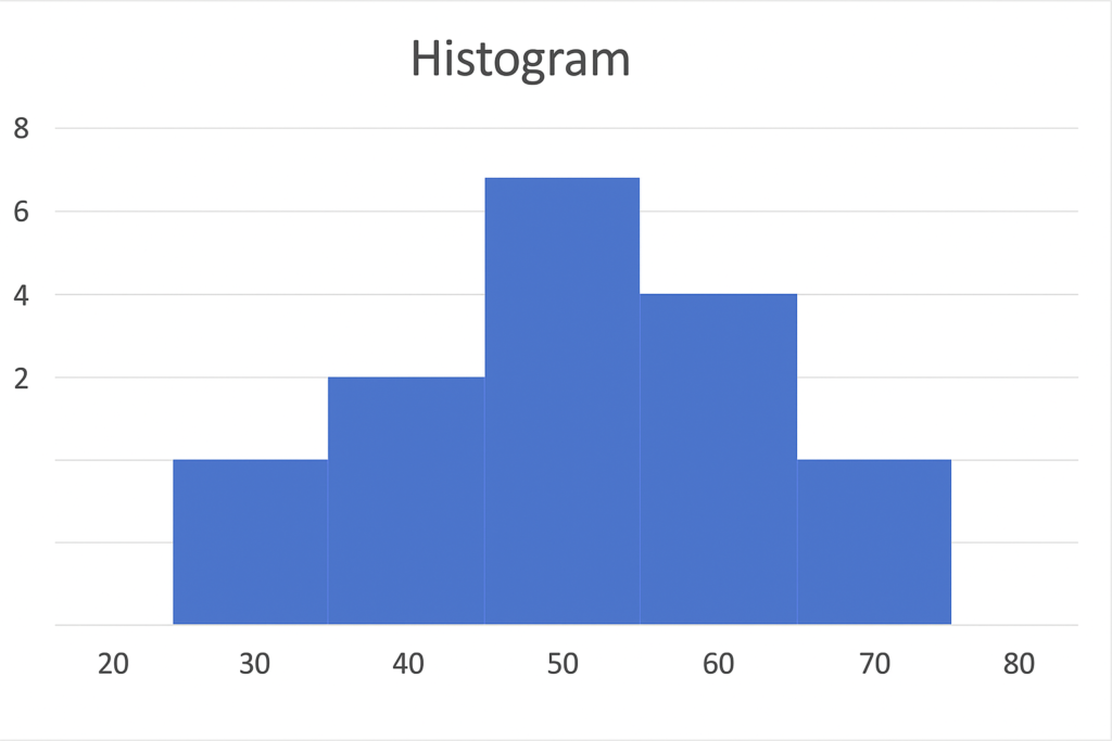
A histogram is a chart that shows how data is spread out. A histogram shows how often numbers fall into certain ranges. These ranges are called bins or intervals. This is different from a simple bar chart, which compares categories.
In simpler terms:
- It helps you understand how data is spread out across a range.
- It answers questions like “How many items fall between 0–10?” or “How often does a value above 70 occur?”
What is the Difference Between a Histogram Chart and a Bar Chart?
Histograms and bar charts both use bars to show data, but they have different uses:
| Feature | Histogram | Bar Chart |
| Data Type | Numerical | Categorical |
| Gaps Between Bars | No | Yes |
| Purpose | Shows data distribution | Compares categories |
| Axis | X-axis shows intervals | X-axis shows categories |
Understanding the distinction helps you use the right chart for the right analysis.
When to Use Histogram Charts?
Histogram charts are especially useful when you want to:
- Analyze the distribution of test scores, ages, income levels, or other continuous data.
- Spot patterns such as skewness, central tendency, or outliers.
- Perform quality control in manufacturing.
- Visualize data grouped in ranges (e.g., 10–20, 21–30).
They’re widely used in statistics, research, finance, marketing, and project analysis.
How to Make a Histogram Chart in Excel?
Here are four effective ways to make a histogram in Excel, using both simple and advanced tools:
Method 1: Using Excel’s Built-In Histogram Chart
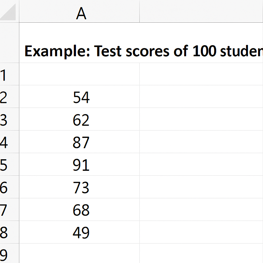
Enter Your Data
- Ensure your data is in a single column (e.g., Column A).
- Example: Test scores of 100 students.
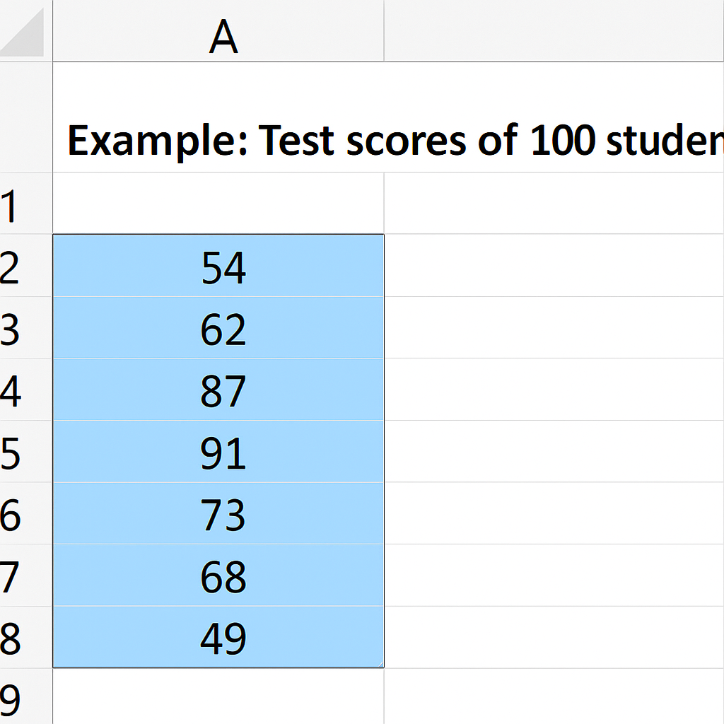
Select Your Data
- Highlight the numerical values.
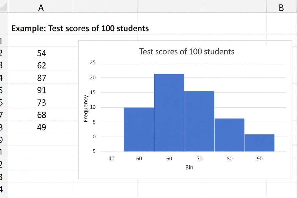
Insert Histogram
- Go to Insert > Charts group > Click the Insert Statistic Chart dropdown > Select Histogram.
- Excel automatically creates the chart with bins.
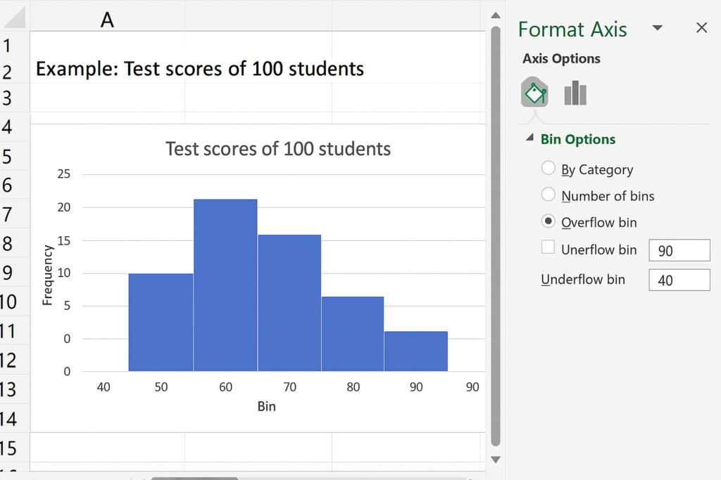
Customize Your Histogram
- Right-click the horizontal axis > Click Format Axis.
- Adjust: Bin width (e.g., intervals of 10). Number of bins. Overflow/Underflow bins
Style the Chart
- Use the Chart Design tab to adjust colors, titles, and layout.
Method 2: Using the Data Analysis Toolpak
This method gives more control and works on all Excel versions (with Toolpak enabled).
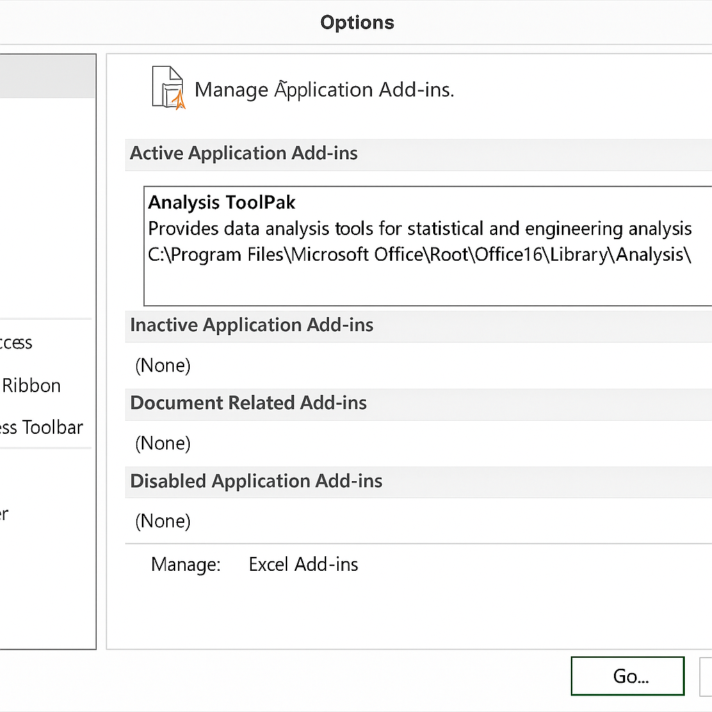
Enable Toolpak (if not already enabled)
- Go to File > Options > Add-ins > Manage: Excel Add-ins > Check Analysis Toolpak.
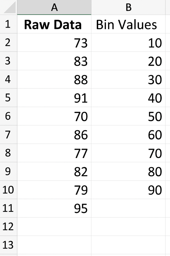
Prepare Your Data
- Enter raw data in one column.
- In a second column, define bin values (e.g., 10, 20, 30…).
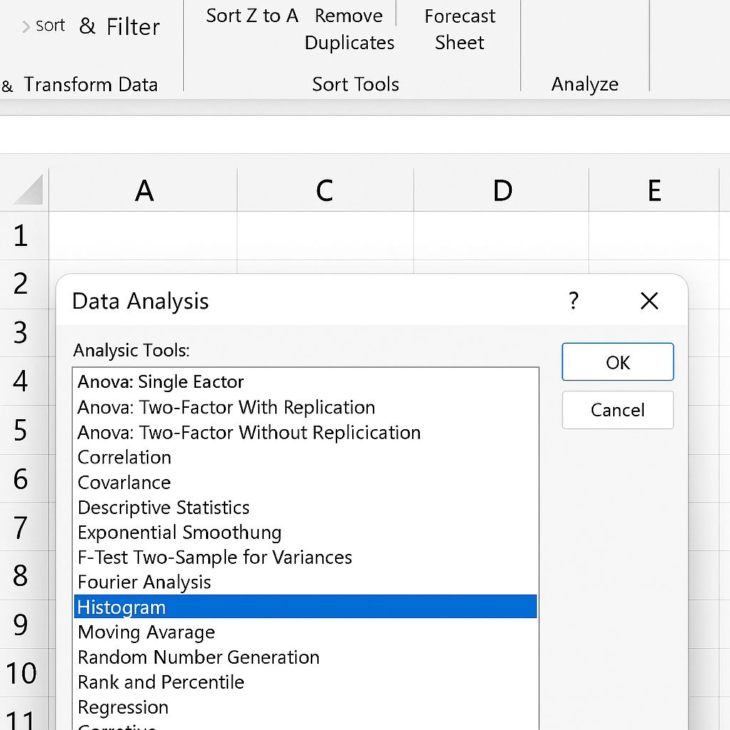
Open Data Analysis
- Go to Data > Data Analysis > Select Histogram > Click OK.
Configure Histogram Settings
- Input Range: Select raw data.
- Bin Range: Select your defined bins.
- Output Range: Choose where to display results.
- Check Chart Output.
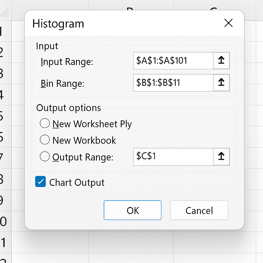
Click OK
- Excel generates a frequency table and histogram chart.
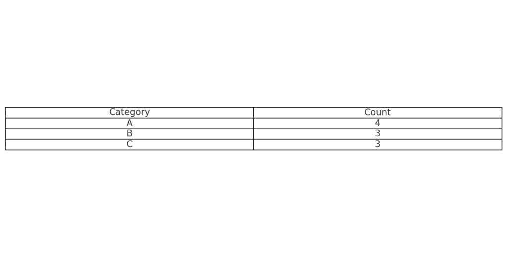
Method 3: Using Pivot Table + Grouping Technique
Create a Pivot Table
- Select your data.
- Go to Insert > PivotTable.
- Drag your value column into Rows and again into Values.
- Set values to “Count.”
Group the Values
- Right-click on a row label (number).
- Choose Group.
- Define start, end, and bin width.
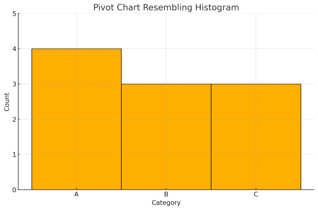
Insert a Pivot Chart
- Go to PivotTable Analyze > PivotChart > Choose Column Chart.
- Format to resemble a histogram (remove gaps between bars).
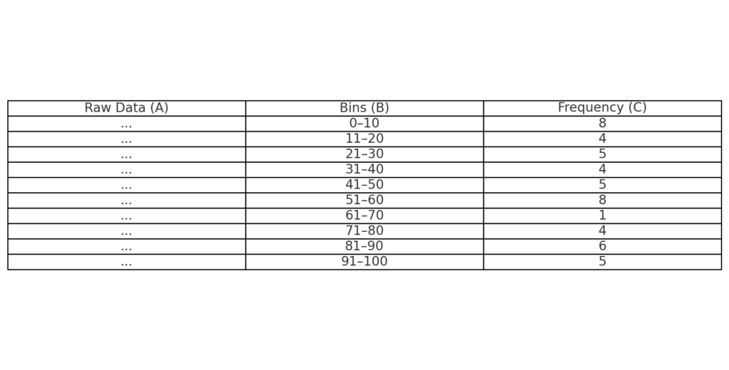
Method 4: Manual Frequency Table + Bar Chart (Pre-2016 Excel)
Prepare Your Data
- Column A: Raw numbers
- Column B: Bins (range groups like 0–10, 11–20, etc.)
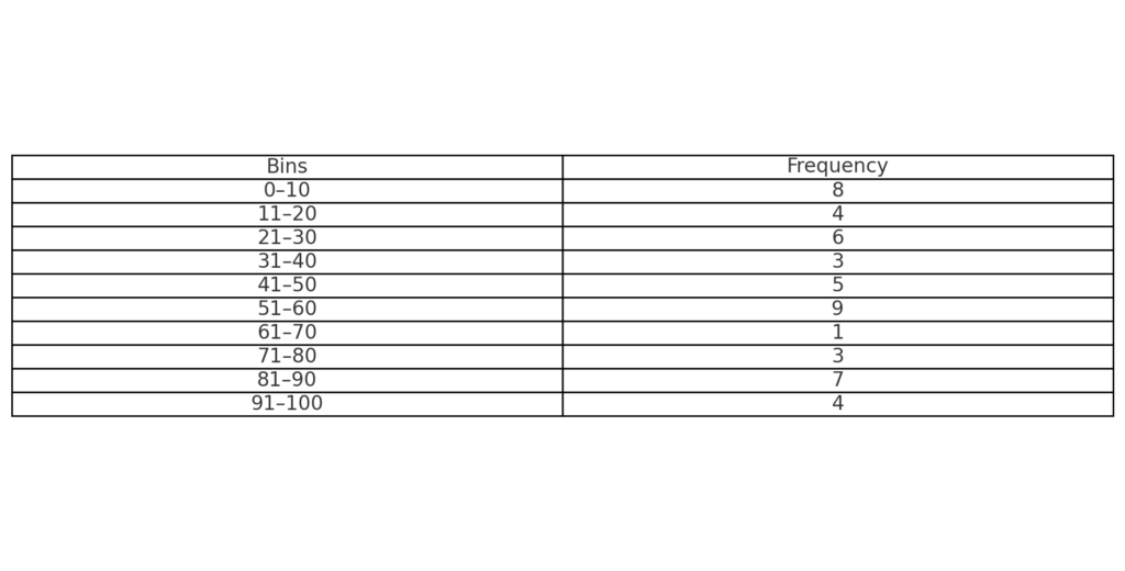
Use FREQUENCY Function
- In Column C, use: =FREQUENCY(A2:A100, B2:B10)
- Press Ctrl + Shift + Enter (Array formula)
Plot the Histogram
- Select bins and frequency counts.
- Insert a Column Chart.
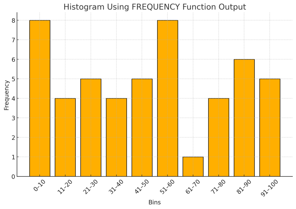
Remove Gaps
- Right-click the bars > Format Data Series > Gap Width: 0%.
This method requires more setup but gives full control and works in older Excel versions.
How to Make a Histogram in Excel
Frequently Asked Questions (FAQ’s)
Can I make a histogram in Excel Online? Yes, but the built-in histogram chart is limited in features. Use the desktop app for full functionality.
Q2. What if the Histogram chart option is missing in my Excel? You’re likely using an older version. Use Method 2 or 4 instead.
Q3. How do I change the number of bins? Right-click the axis > Format Axis > Adjust the bin width or count as needed.
Q4. Can I use non-numeric data in histograms? No. Histograms are specifically for numerical, continuous data only.
Conclusion
Learning histograms in Excel helps you find hidden patterns in your data clearly. Excel 2016 offers unmatched flexibility. You can use its built-in charts or create your own with PivotTables or formulas. By using this guide, you’re not just creating a chart. You’re also gaining insight. If you liked this guide, check out our full Excel series. It can help you improve your data analysis skills even more.