

Box and Whisker plots, or Box Plots, are great for showing how data is spread out. Charts are great for spotting medians, quartiles, and outliers quickly. You can use them to analyze business trends or summarize academic results. In this guide, we’ll walk you through how to create a Box and Whisker Plot in Microsoft Excel—step by step. Also, we’ll show you how to read your chart. This helps you make confident, data-driven choices.
What’s a Box and Whisker Chart?
A Box and Whisker Plot is a statistical chart that displays the spread and skewness of a data set. It divides data into quartiles. It also shows the median, upper and lower quartiles, and outliers. Here’s what it typically shows:
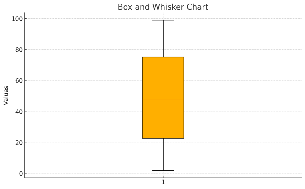
- Minimum (lower whisker)
- First Quartile (Q1)
- Median (Q2)
- Third Quartile (Q3)
- Maximum (upper whisker)
This type of chart is ideal for comparing data distributions across different categories, making it popular in education, research, and data science.
How to Make a Box and Whisker Plot in Excel?
Follow these steps to create a Box and Whisker chart in Excel (works in Excel 2016 and later):
Step 1: Prepare Your Data
Arrange your dataset in a single column or multiple columns (if comparing categories). For example:
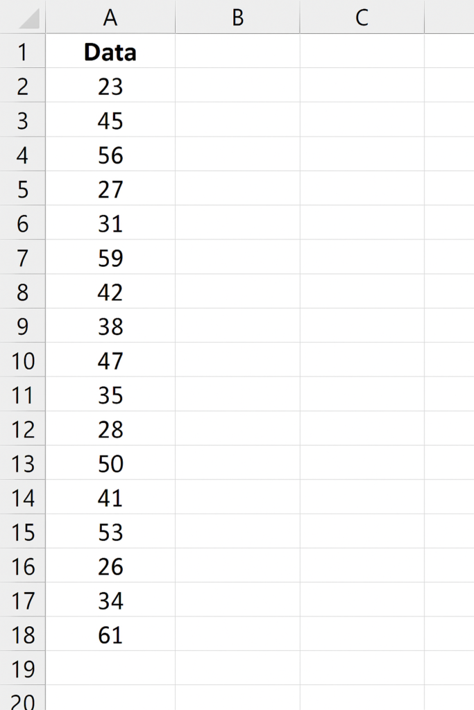
Tip: Make sure your data is clean and numerical.
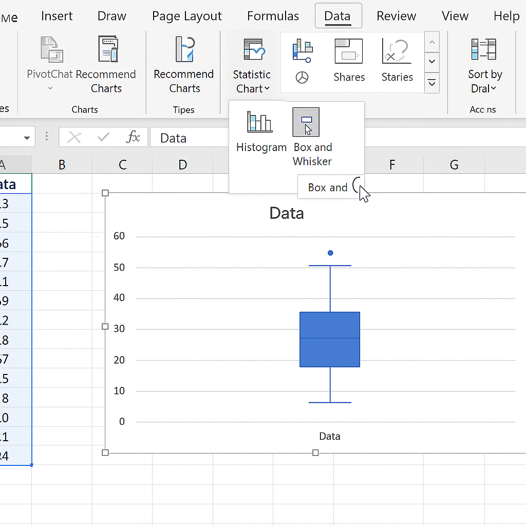
Step 2: Insert the Box and Whisker Plot
- Highlight your dataset (include headers).
- Go to the Insert tab.
- In the Charts group, click on the Insert Statistic Chart dropdown.
- Select Box and Whisker.
Excel will automatically generate the plot based on your data structure.
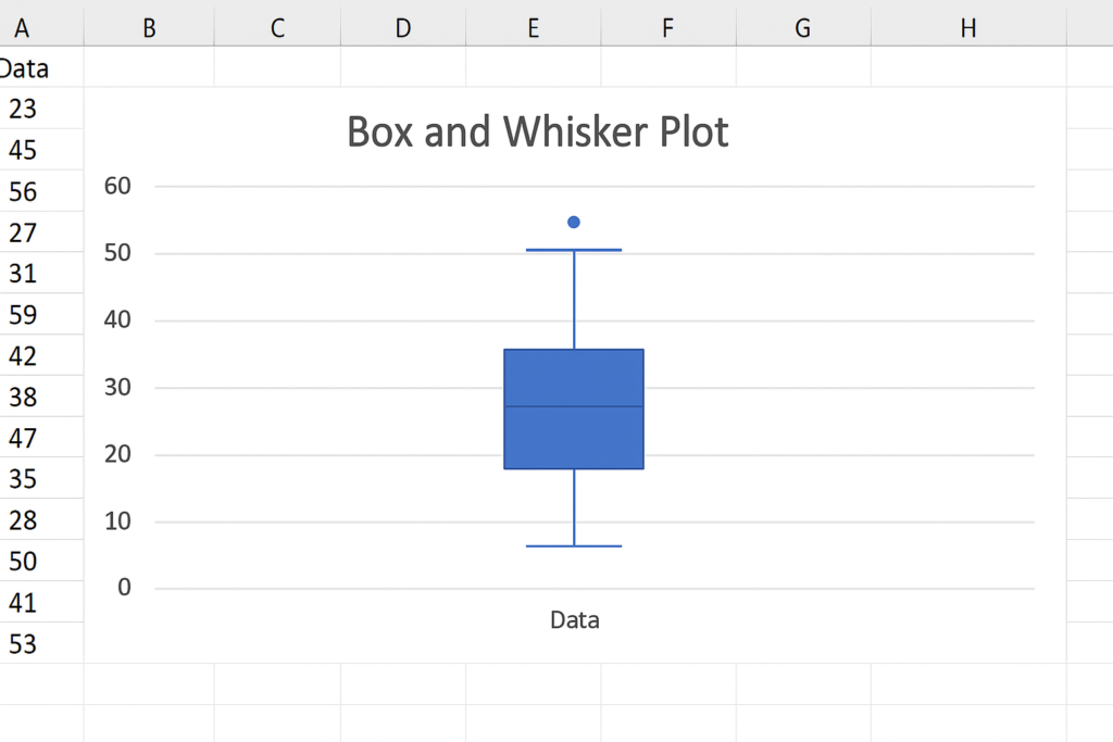
Step 3: Customize the Chart
- Chart Title: Click to rename your chart.
- Axis Titles: Add descriptive axis labels for clarity.
- Format Elements: Right-click on elements (box, whiskers, outliers) to adjust colors, styles, or visibility.
Optional: Use the Chart Elements button (+ icon) to toggle data labels or gridlines.
How to Read a Box and Whisker Plot?
To interpret a Box and Whisker chart:
- The box shows the interquartile range (IQR)—the middle 50% of values.
- The line inside the box is the median.
- Whiskers show the minimum and maximum values within 1.5 IQR.
- Dots or asterisks represent outliers.
Example:
If the median is closer to the lower quartile, your data is right-skewed. If whiskers vary in length, it shows variability in your dataset.
Benefits of an Automatic Box and Whisker Plot Maker
Time-Saving
- Instantly generates the chart without manual calculations.
- Ideal for users who need quick visualizations for reports or presentations.
No Manual Statistical Work
- Automatically calculates quartiles (Q1, Q2, Q3), minimum, maximum, and outliers.
- Eliminates human error in statistical computation.
User-Friendly Interface
- Drag-and-drop data input or simple paste/upload options.
- Requires no technical skills—perfect for students, teachers, and professionals.
Visual Accuracy
- Clearly displays data spread, skewness, and variability.
- Outliers are highlighted automatically for deeper insights.
Professional-Quality Output
- Many tools allow exporting charts in high resolution (PNG, SVG, PDF).
- Suitable for academic, scientific, or business documentation.
Customizable Options
- Adjust colors, labels, axis titles, and chart styles.
- Add multiple categories for comparative analysis.
How To Make A Box Plot In Excel | Make a Box and Whisker Plot in Excel
Frequently Asked Questions
Can I create a Box and Whisker Plot in older versions of Excel?
Box plots are natively supported only in Excel 2016 and later. For older versions, you can simulate one using stacked bar and line charts—but it’s more complex.
What types of data work best with Box and Whisker Plots?
Quantitative and continuous data. It’s ideal for test scores, sales trends, or any data where spread and central tendency matter.
Can I highlight outliers in Excel’s Box Plot?
Yes. Excel automatically flags outliers with dots. You can change their appearance using Format Data Series.
What if my Box and Whisker chart doesn’t appear correctly?
Double-check your data structure. Excel expects a category with numeric values. Also, ensure you’re using Excel 2016+.
Conclusion
Making a Box and Whisker Plot in Excel is easy and effective for showing your data. This chart type gives you quick, visual insights. You can compare student performance. You can also analyze sales across different quarters. By mastering it, you add a critical tool to your data analysis arsenal. Keep up with Excel features and organize your data clearly. Google favors helpful, clear, expert content, so your charts should show this too.