

Creating a bell curve in Excel is a powerful way to visually represent the distribution of data. A bell curve helps you understand your data better. Whether you’re looking at student grades, business performance, product quality, or customer satisfaction scores, it reveals important patterns. With Excel, you don’t need fancy statistical software. You only need some formulas and charting tools.
What is a Bell Curve in Excel?
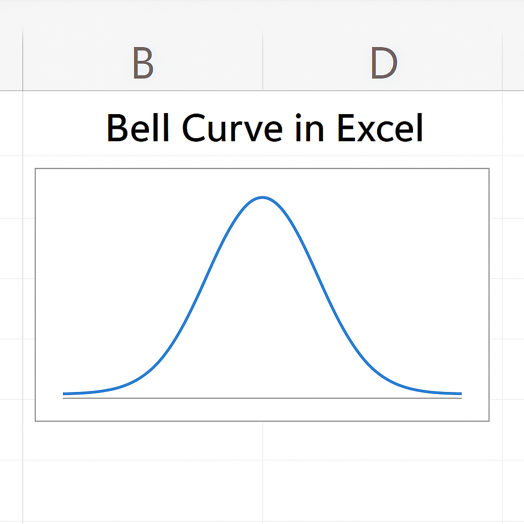
A bell curve, or normal distribution curve, shows data that is evenly spread around a central average. It looks like a bell. The middle peak shows the average, and the curve drops evenly on both sides.
In statistics, the bell curve shows how values group around the average. It also helps spot outliers and patterns. In Excel, a bell curve is typically created using formulas (like NORM.DIST) and a line chart to plot the curve.
Common characteristics of a bell curve:
- Symmetrical shape
- Most data points fall near the center
- Fewer data points exist at the extremes (tails)
It helps compare performance, analyze probability, and understand variability in data.
How to Create a Bell Curve in Excel
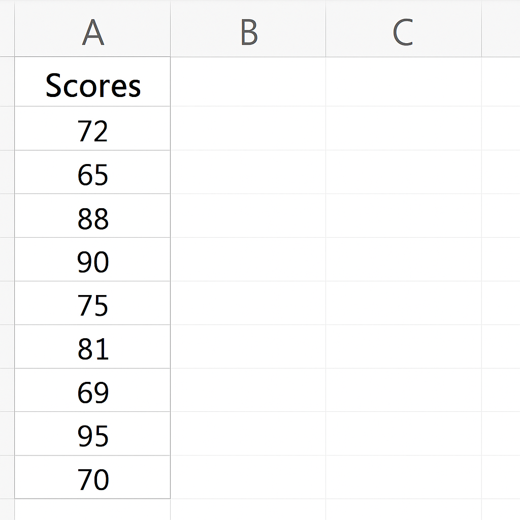
Step 1: Prepare Your Data
Start by entering your raw data into a column. For example, suppose you’re analyzing exam scores:
| A (Scores) |
| 72 |
| 65 |
| 88 |
| 90 |
| 75 |
| 81 |
| 69 |
| 95 |
| 70 |
| 85 |
You’ll calculate the mean and standard deviation from this data.
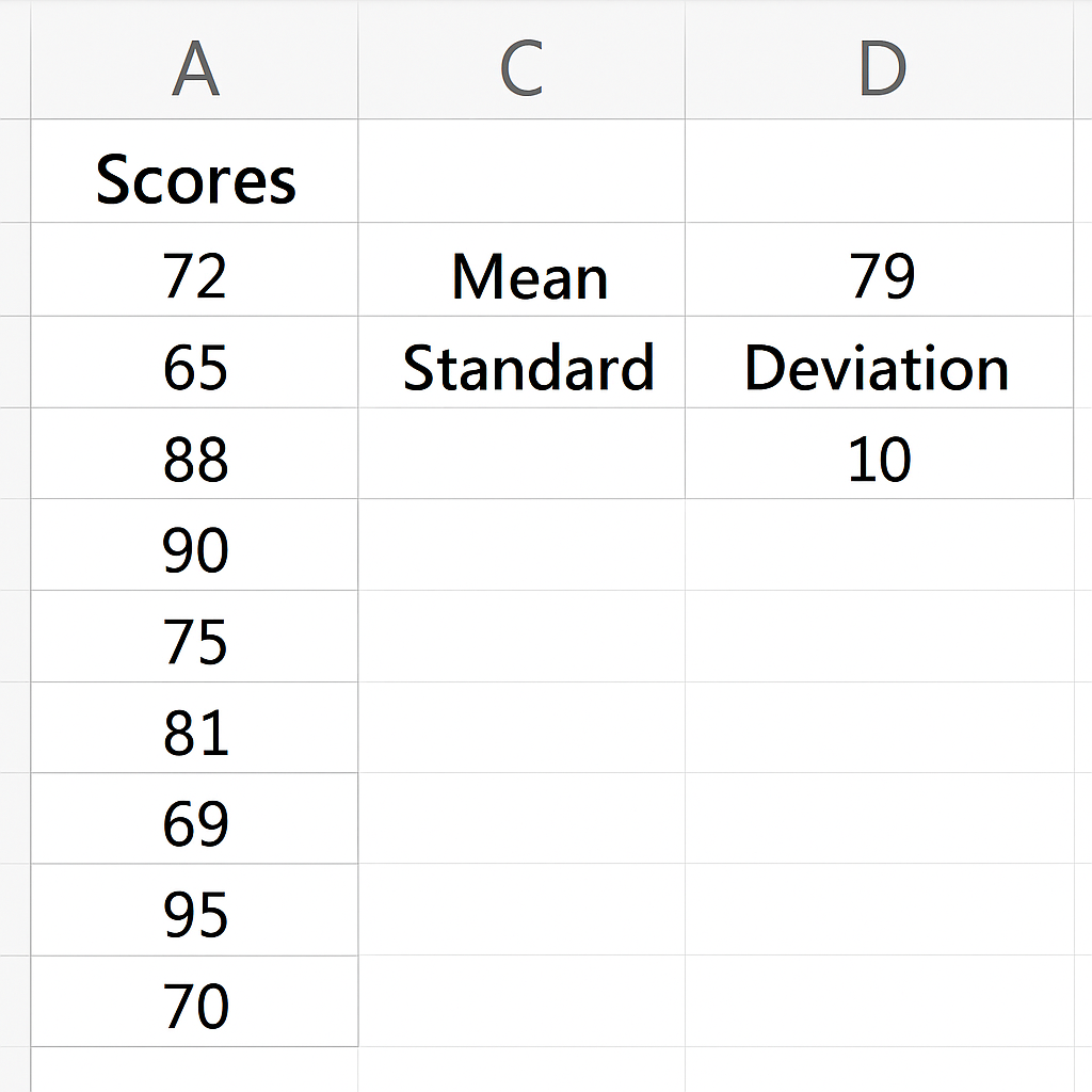
Step 2: Calculate the Mean and Standard Deviation
Use the following formulas:
=AVERAGE(A2:A11) → This gives you the Mean
=STDEV.P(A2:A11) → This gives you the Standard Deviation
Let’s assume:
- Mean = 79
- Standard Deviation = 10
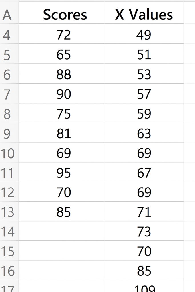
Step 3: Create the X-Axis Values
To make a smooth curve, generate x-values from the lowest to the highest possible values. Aim for a range of ±3 standard deviations from the mean.
For example:
| B (X Values) |
| 49 |
| 51 |
| 53 |
| … |
| 109 |
You can create a series from =Mean – 3*StdDev to =Mean + 3*StdDev using increments of 2 or 1.
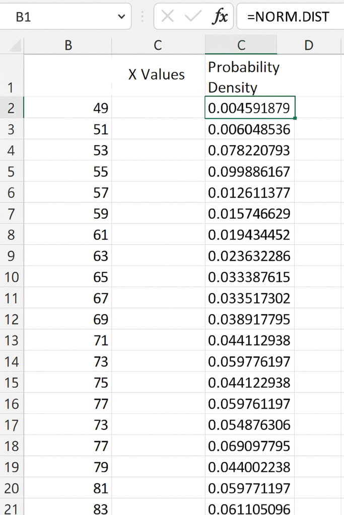
Step 4: Apply the NORM.DIST Formula
In column C, use the NORM.DIST formula to calculate the probability density for each x-value:
=NORM.DIST(B2, $E$1, $E$2, FALSE)
Here:
- B2 is your x-value.
- $E$1 is your mean.
- $E$2 is your standard deviation.
- FALSE ensures the function returns the probability density (for graphing the curve).
Drag this formula down for all x-values.
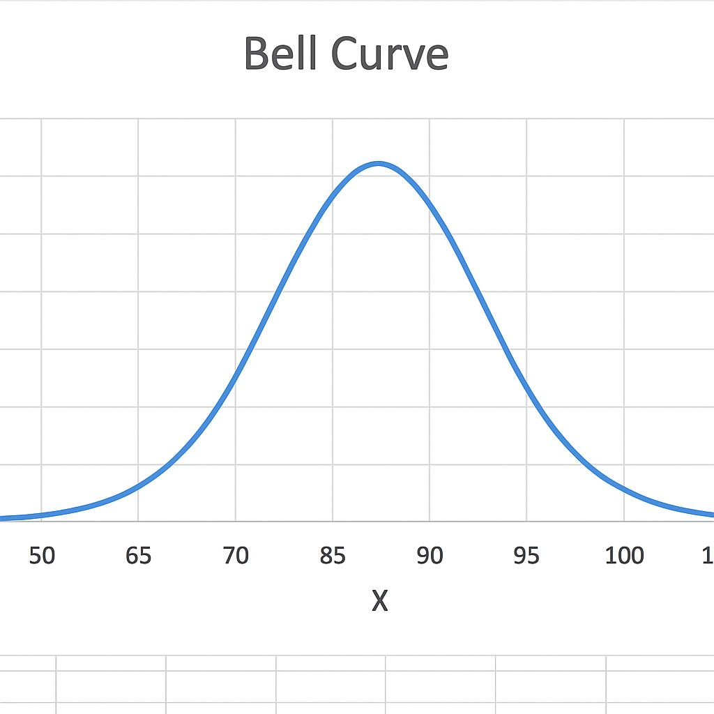
Step 5: Insert a Scatter Chart with Smooth Lines
- Select your x-values and y-values (Columns B and C).
- Go to Insert → Charts → Scatter with Smooth Lines.
- Excel will generate a bell-shaped curve.
You can then format the chart (title, labels, gridlines, colors) as needed.
Examples
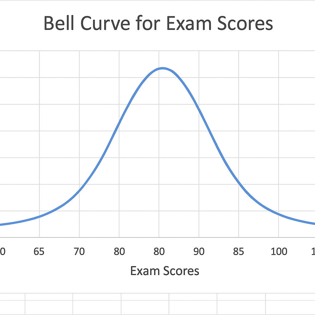
Example 1: Bell Curve for Exam Scores
You’re analyzing the distribution of scores for a class of students. The bell curve shows how students score compared to the mean. It helps us see who is within 1, 2, or 3 standard deviations from the average. This is useful for grading based on statistical cutoffs.
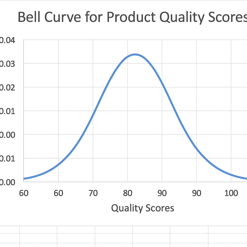
Example 2: Bell Curve for Product Quality Scores
In quality control, suppose you score products based on defects. The bell curve shows how many products are within the acceptable range and how many are outliers. This helps improve manufacturing consistency.
Benefits of Creating a Bell Curve in Excel
Provides a Clear Visual Representation
The bell curve gives an intuitive visual of how your data is spread out. Stakeholders can quickly see where most of the data is, instead of just looking at raw numbers. This simplifies decision-making in areas like hiring, grading, or risk management.
Helps Detect Outliers
By observing the shape of the curve, you can easily identify extreme values (outliers). This is critical in data analysis, quality control, or financial modeling. For example, if your sales data has some very high or low numbers, the bell curve will show them clearly.
Supports Data-Driven Grading Systems
In education, teachers usually grade students by comparing their scores to the average. A bell curve makes this transparent. You can see how many students fall into the top 10%, bottom 10%, and the average group.
Enhances Business Forecasting
Businesses use bell curves to model customer behavior, forecast demand, or predict risk. Knowing the odds of different outcomes helps you plan for the best and worst cases. This can make your budgeting more accurate.
Assists in Employee Evaluation
In HR, bell curves help assess performance fairly. If performance scores cluster tightly around the mean, it may suggest uniformity. A wide spread can show high performers or underperformers. This information is useful for promotions, training, or restructuring.
How to Create a Bell Curve In Microsoft Excel
FAQ’s
What is the difference between a histogram and a bell curve?
A histogram is a column chart that shows how often values appear in a dataset. A bell curve is a smooth line. It shows the theoretical distribution based on probability.
Do i need a specific version of excel to create bell curves?
No. Any version of Excel from 2010 onward supports key functions. These include NORM.DIST, scatter charts, and standard deviation formulas. Excel 365 makes it even easier with dynamic arrays.
Can bell curves be used for small datasets?
Yes, but the results may not be statistically accurate. Bell curves work better with large datasets. The central limit theorem helps make sure of a normal distribution.
How to label standard deviation areas on bell curve in excel?
You can add data labels or vertical lines at mean ±1σ, ±2σ, and ±3σ. Just insert shapes or use error bars in the chart for reference.
Conclusion
Creating a bell curve in Excel is a valuable skill for anyone working with data. A bell curve makes complex information easier to understand. Whether you analyze performance, forecast outcomes, or review distributions, it helps you take action. Excel has all the tools you need to create this chart. You won’t need any advanced statistics software.