

Microsoft Excel isn’t just for spreadsheets. It’s also great for visualizing data. Graphs are one of the best ways to show patterns, trends, and comparisons. Creating graphs in Excel helps you turn raw numbers into useful insights. This skill is valuable for financial analysis, academic research, sales reports, and customer data. Creating a graph in Excel is fast, simple, and highly customizable. In just a few clicks, you can turn data into visual stories. These stories make your findings easier to understand and share.
What is a Graph in Excel?
An Excel graph shows data visually. It uses charts like lines, columns, bars, pies, and areas. Graphs help users interpret numeric data quickly by making patterns more visible. Excel graphs are dynamic, meaning they can update automatically as your data changes.
Graphs in Excel are typically used to:
- Show trends over time (Line graphs)
- Compare values across categories (Bar or Column charts)
- Display data proportions (Pie charts)
- Highlight relationships (Scatter plots)
- Track progress (Area and Combo charts)
Excel has tools that let anyone make professional graphs. You don’t need design or coding skills.
How to Create Graphs in Excel
Creating a graph in Excel involves a few key steps. Here’s how to do it from scratch:
Step 1: Prepare Your Data
Start by organizing your data in a table. Graphs work best when the data is structured with:
- Column headers as labels (e.g., Months, Categories)
- Rows for values (e.g., Sales, Units)
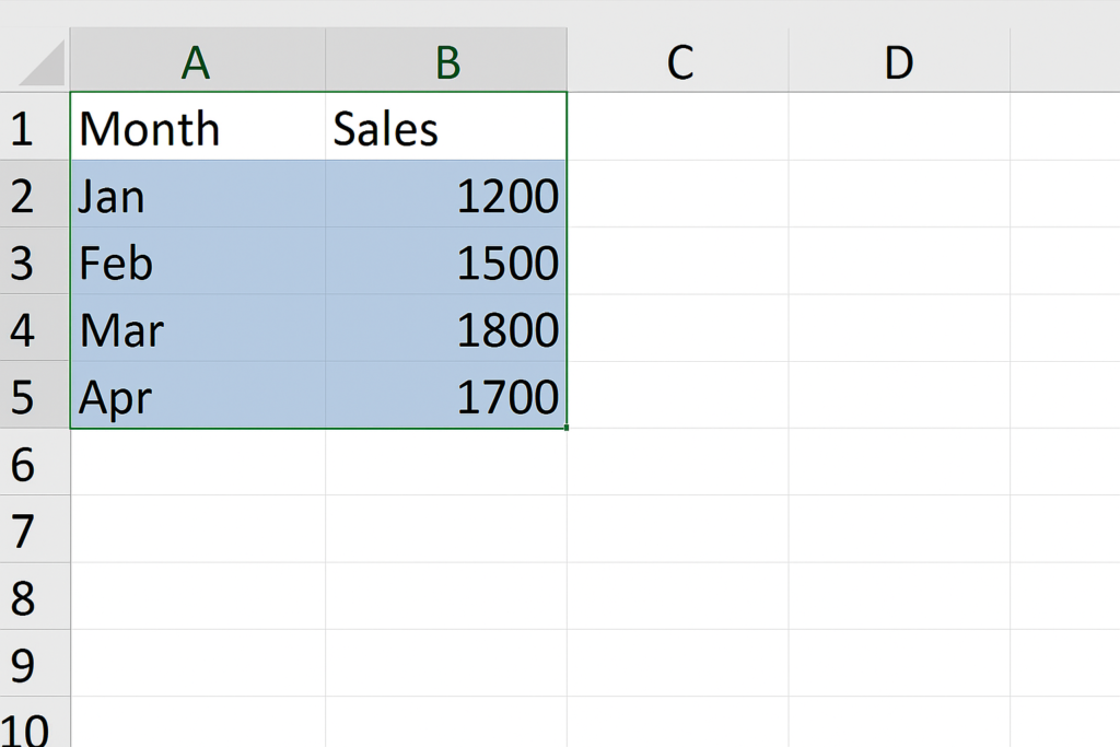
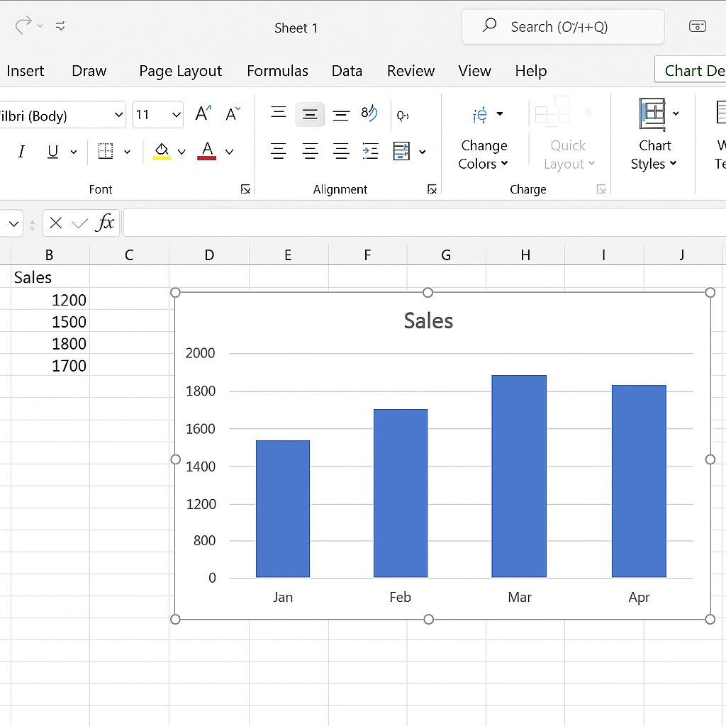
Example:
| Month | Sales |
| Jan | 1200 |
| Feb | 1500 |
| Mar | 1800 |
| Apr | 1700 |

Step 2: Select the Data Range
Click and drag to select both your category and value columns. In this case, select A1:B5.
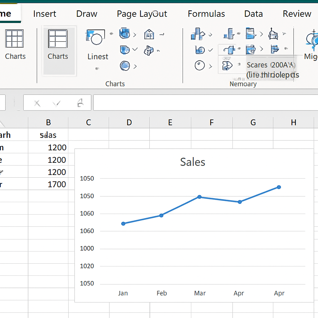
Step 3: Insert a Graph
- Go to the Insert tab on the Excel ribbon.
- Choose a chart type from the Charts group. Common options. Line Chart: Great for trends over time. Column or Bar Chart: Best for comparisons. Pie Chart: Ideal for proportions. Scatter Plot: Used to show relationships.
- Click on the chart icon, and Excel will insert a default graph based on your data.
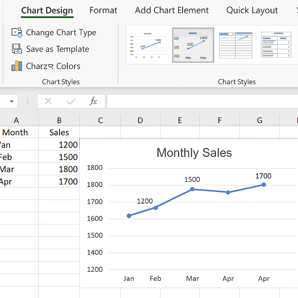
Step 4: Customize the Graph
After inserting the graph, you can personalize it:
- Click the chart and use the Chart Design and Format tabs.
- Change chart title: Double-click and edit.
- Add data labels: Right-click on bars/lines > Add Data Labels.
- Adjust colors: Use the “Change Colors” button or format tools.
- Modify axes: Right-click axis > Format Axis to adjust scale, range, and labels.
Step 5: Update and Save
- To update the graph automatically, keep your data in a table format.
- Save your Excel workbook to retain the graph.
Examples
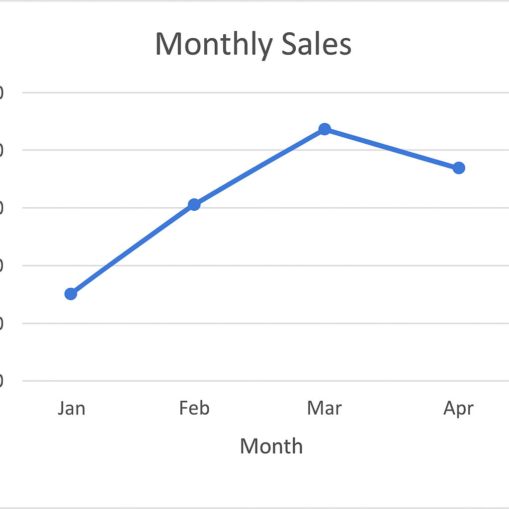
Example 1: Line Graph for Monthly Sales
Using months as the X-axis and sales as the Y-axis, you can create a line graph to visualize the trend over time. This helps management see whether sales are increasing, stable, or dropping.
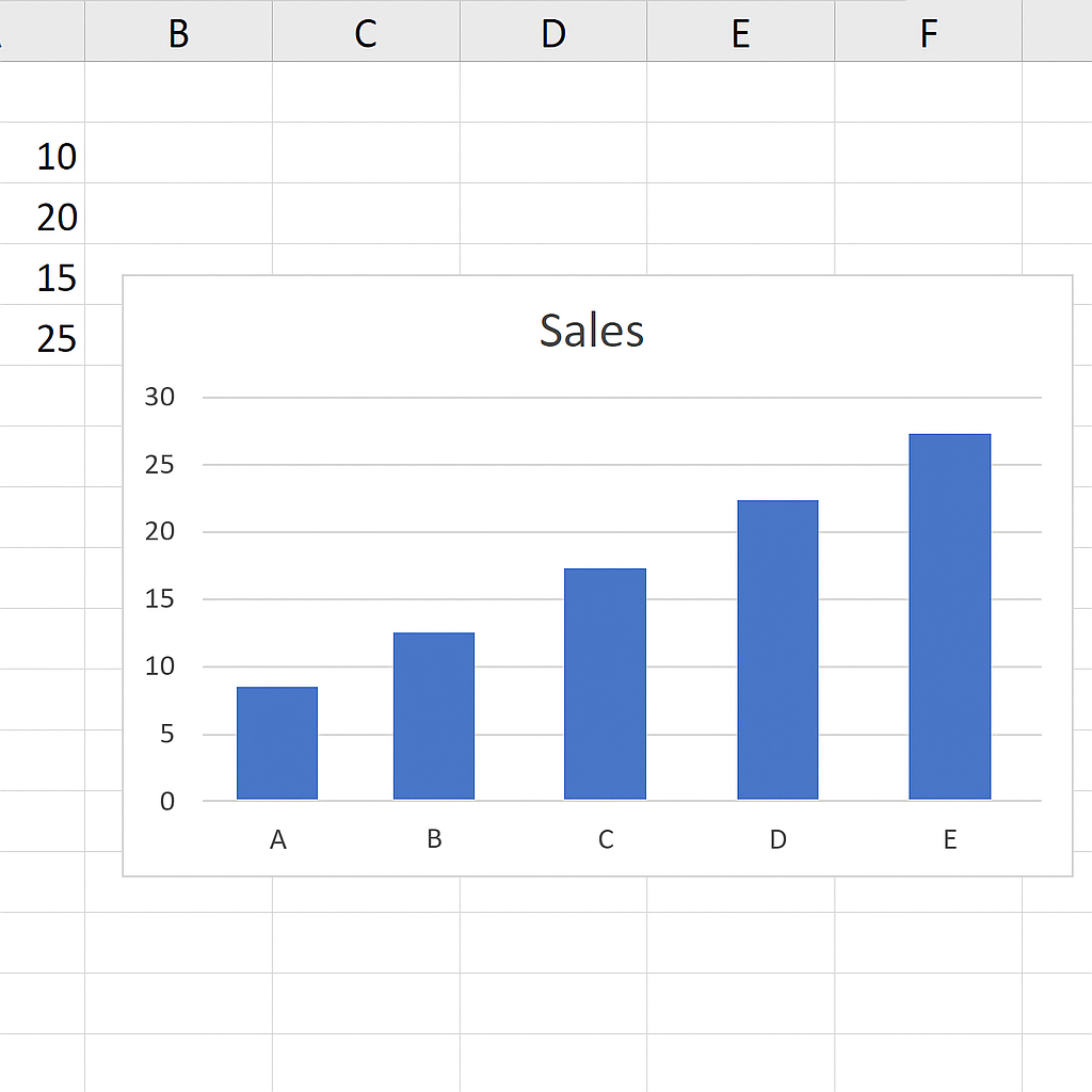
Example 2: Column Graph for Product Comparison
If you’re comparing sales between products, a column chart is ideal. It displays each product category side by side so differences are easily visible.
| Product | Units Sold |
| A | 300 |
| B | 500 |
| C | 250 |

Benefits of Creating Graphs in Excel
Transforms Complex Data into Simple Visuals
Graphs simplify complex datasets by making the story behind numbers clear and immediate. This is especially useful for presentations, client meetings, and reports. Quick interpretation is key. For example, a graph quickly shows if monthly sales are going up or down. It’s clearer than a table.
Enhances Decision Making
With graphs, stakeholders can make faster and more informed decisions. Visual patterns help you see trends, compare metrics, and find areas needing attention. Graphs turn raw data into useful insights. They help with demand forecasting, customer behavior analysis, and revenue tracking.
Saves Time in Reporting
Graphs speed up the reporting process by providing a snapshot of the entire dataset. Users can use visual cues to understand performance instead of analyzing data manually. This efficiency is especially valuable in dashboards and automated reporting tools.
Increases Engagement and Understanding
A well-designed graph is more engaging than tables full of numbers. It grabs attention and helps people understand better, especially those not familiar with the data. Presentations with graphs connect better with viewers and spark discussion.
Dynamic and Auto-Updating
Excel graphs can be linked to dynamic tables or PivotTables, allowing them to update automatically as data changes. This ensures that your visuals always reflect the latest information. It’s particularly useful in monthly reports or KPI dashboards where values update.
Excel Charts and Graphs Tutorial
FAQ’s
How to insert graph in same sheet as my data?
After creating a chart, simply drag and place it near your data. You can also right-click and choose Move Chart > Object in Sheet1 to embed it on the same worksheet.
What is the difference between a chart and a graph in excel?
The terms are often used interchangeably, but technically, a graph plots data points along axes (like a line or scatter plot), while a chart is a broader term that includes all visual data representations (graphs, pies, maps, etc.).
How to export excel graph for use in powerpoint or word?
Click the chart, then copy it (Ctrl + C) and paste it into PowerPoint or Word. You can paste as a linked object (updates with Excel) or as a static image.
How to label data points in excel graph?
Right-click on any bar, line, or point, then select Add Data Labels. You can format labels to show values, percentages, or custom text.
Conclusion
Making graphs in Excel is a key skill. It changes how you show, analyze, and share data. Excel charts give you quick, flexible, and smart visuals. Dashboards, reports, or pitches to stakeholders—these tools help you succeed.