

When you analyze data in Excel, it’s important to understand how two variables relate. This could be spending on sales and ads, age and income, or temperature and demand for products. The scatter plot is a powerful tool to visualize this kind of relationship. It shows points on a chart. This helps users see how one variable affects another. They can spot trends, correlations, and outliers easily. In this comprehensive guide, we will explain what a scatter plot is, how to create one step-by-step in Excel, real-world examples, benefits of using it, and answers to frequently asked questions.
What Is a Scatter Plot?
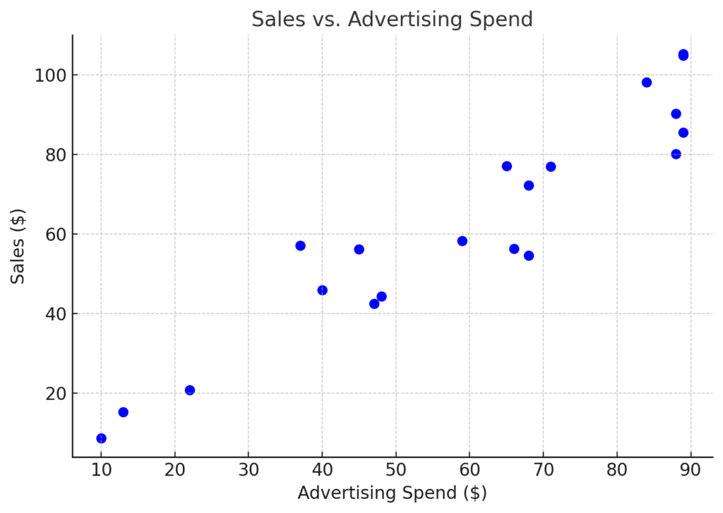
A scatter plot, or scatter chart, shows how two numbers relate. It uses dots to represent the data. Each point shows an observation from the dataset. The x-axis displays one variable, while the y-axis shows another.
This type of chart is commonly used in:
- Statistical analysis
- Scientific experiments
- Business and sales data review
- Performance comparisons
- Machine learning and data science
Key Characteristics:
- Each dot represents a single data pair (X, Y)
- Useful for identifying trends, patterns, or outliers
- Often used to determine correlation between variables
How Do You Do a Scatter Plot in Excel
Creating a scatter plot in Excel is quick and user-friendly, even for beginners. Below is the complete step-by-step process:
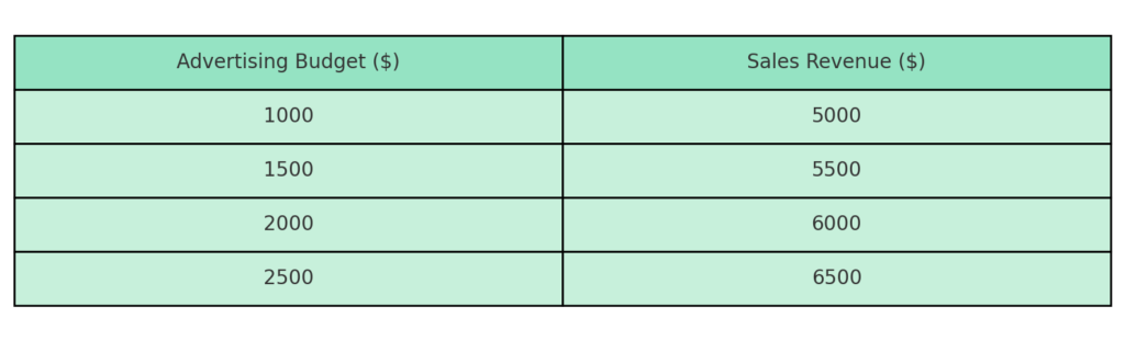
Step 1: Prepare Your Data
Organize your data in two columns:
- Column A: Independent variable (X-axis)
- Column B: Dependent variable (Y-axis)
For example:
| Advertising Budget | Sales Revenue |
| 1000 | 5000 |
| 1500 | 5500 |
| 2000 | 6000 |
| 2500 | 6500 |

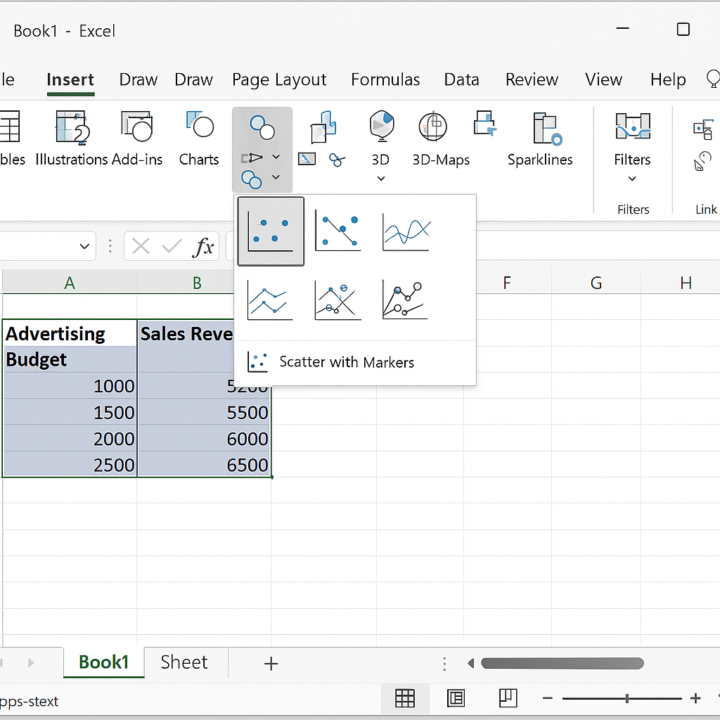
Step 2: Select Your Data
Highlight the two columns, including headers if you have them.
Step 3: Insert a Scatter Plot
- Go to the Insert tab on the Excel ribbon.
- In the Charts group, click the Insert Scatter (X, Y) Chart icon.
- Choose the first option: Scatter with only Markers.
Your scatter plot will appear on the worksheet.
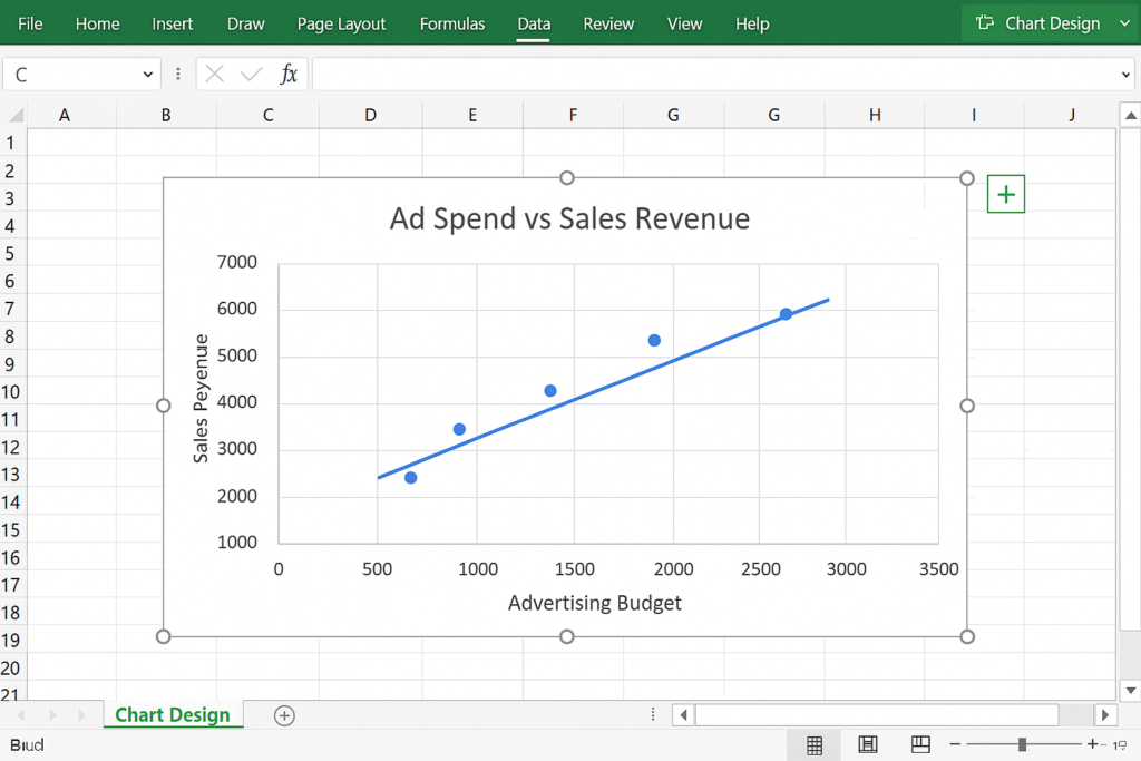
Step 4: Customize the Chart
You can enhance your scatter plot by formatting it to better display your data.
Add Chart Title:
- Click the chart title placeholder and type a descriptive title, such as “Ad Spend vs Sales Revenue”.
Add Axis Titles:
- Click the chart.
- Go to Chart Elements (+ icon at top right of the chart).
- Check Axis Titles.
- Label X-axis as “Advertising Budget” and Y-axis as “Sales Revenue”.
Format the Markers:
- Right-click on a marker > Format Data Series to change color, size, or shape.
Add a Trendline (Optional):
To identify correlation, you can add a line of best fit.
- Click on a data point.
- Go to Chart Elements and check Trendline.
- Customize type (Linear, Exponential) under Trendline Options.
Examples
Example 1: Student Hours Studied vs Exam Scores
| Hours Studied | Exam Score |
| 2 | 65 |
| 4 | 70 |
| 6 | 75 |
| 8 | 85 |
| 10 | 90 |
A scatter plot of this data shows a positive trend—more study hours lead to higher scores.

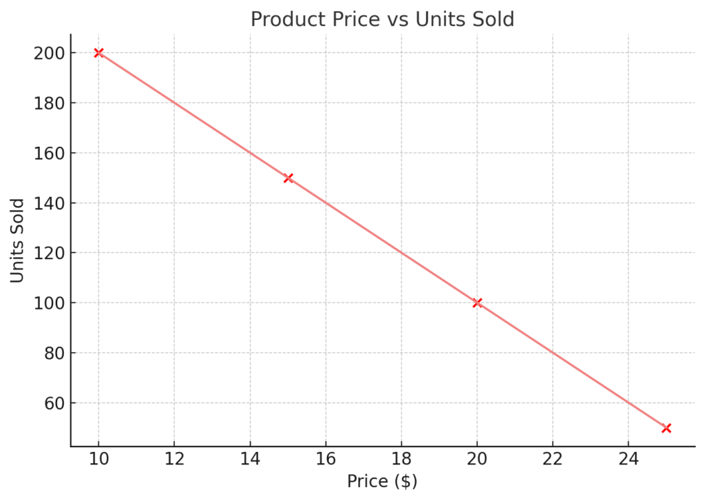
Example 2: Product Price vs Units Sold
| Price | Units Sold |
| 10 | 200 |
| 15 | 150 |
| 20 | 100 |
| 25 | 50 |
This plot shows a negative correlation—higher prices result in fewer units sold.
Benefits of Using a Scatter Plot in Excel
Reveals Relationships Between Variables
Scatter plots make it easy to visually identify relationships, such as:
- Positive correlation (when both variables increase)
- Negative correlation (when one increases, the other decreases)
- No correlation
This is especially useful in predictive modeling, sales analysis, or academic research.
Highlights Outliers Clearly
When working with real-world data, outliers are inevitable. Scatter plots help you quickly see unusual data points that stand out from the pattern. These outliers may signal:
- Data entry errors
- Special cases
- Opportunities for further investigation
Useful for Trend Analysis and Forecasting
Excel helps spot long-term trends or patterns by adding a trendline to your scatter plot. You can also:
- Display the equation of the trendline
- Show the R-squared value to measure the strength of the correlation
These features are essential in regression analysis and forecasting.
Enhances Reports and Presentations
A scatter plot adds visual impact to reports and dashboards. You provide your audience with a clear, easy-to-understand visual summary instead of just data tables. Marketing, HR, finance, and operations pros use scatter plots. They show KPIs and trends in presentations.
Easy to Create and Customize
Excel’s scatter plot feature is beginner-friendly and highly customizable. You can:
- Adjust color and style
- Add titles and labels
- Use dynamic data ranges
- Update plots automatically as data changes
Scatter plots are easy for everyone to use, from students to expert analysts.
Creating an XY Scatter Plot in Excel
FAQ’s
Why doesn’t my scatter plot show the right data?
Ensure your X and Y columns are both numeric and correctly selected. If Excel shows the wrong axis, switch the rows and columns. Go to Chart Design and click Switch Row/Column.
How do I add data labels to a scatter plot?
Click a point > right-click > Add Data Labels. You can then format the labels to show specific values or even names by editing the data label range.
Can I update my scatter plot automatically?
Yes. If your chart is based on a dynamic named range or Excel Table, it will update automatically as new rows are added.
What’s the difference between a line chart and a scatter plot?
A line chart connects data points in sequence, best for time-based trends. A scatter plot compares two variables by showing each data point separately. This makes it great for analyzing relationships or distributions.
Conclusion
Creating a scatter plot in Excel is a powerful way to analyze relationships between two sets of data. A scatter plot shows you patterns, outliers, and possible correlations. You can use it to compare things like sales and marketing spend or student scores and study time. Mastering scatter plots helps you make better decisions. It gives you deeper insights into data. Plus, you can present your findings clearly and confidently.