

In a world overflowing with data, clarity is key. Visualizing patterns helps make insights more actionable. This is true whether you’re analyzing sales figures, tracking website traffic, or studying scientific results. That’s where trendlines in Excel come in. This guide will help you add a trendline in Excel. It will explain what trendlines are and provide real-world examples. You’ll also learn about their benefits and find answers to common questions.
What Is a Trendline?
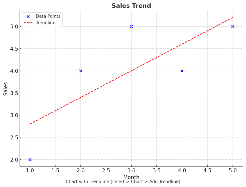
A trendline is a line added to a chart. It shows the general direction or pattern of data over time. It helps you:
- Identify trends (increasing, decreasing, or stable)
- Forecast future values
- Understand relationships between variables
Trendlines are often found in line charts, bar charts, and scatter plots. They work well for both basic and complex data analysis.
Types of Trendlines in Excel:
- Linear: A straight line; best for data with a consistent trend.
- Exponential: Curved line; used when data rises or falls at increasing rates.
- Logarithmic: Fits data that increases quickly and then levels off.
- Polynomial: For fluctuating data, ideal for more complex patterns.
- Power: For data that increases at a specific rate.
- Moving Average: Smooths short-term fluctuations to reveal trends.
How to Add a Trendline in Excel?
Adding a trendline in Excel is easy once your data is visualized on a chart. Here’s a step-by-step breakdown:
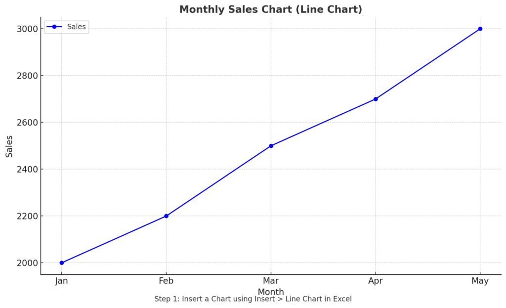
Step 1: Insert a Chart
- Enter your data into two columns. For example:
| Month | Sales |
| Jan | 2000 |
| Feb | 2200 |
| Mar | 2500 |
| Apr | 2700 |
| May | 3000 |
- Select your data range.
- Go to the Insert tab.
- Choose a chart type: Use a Line Chart or Scatter Plot for best results with trendlines.
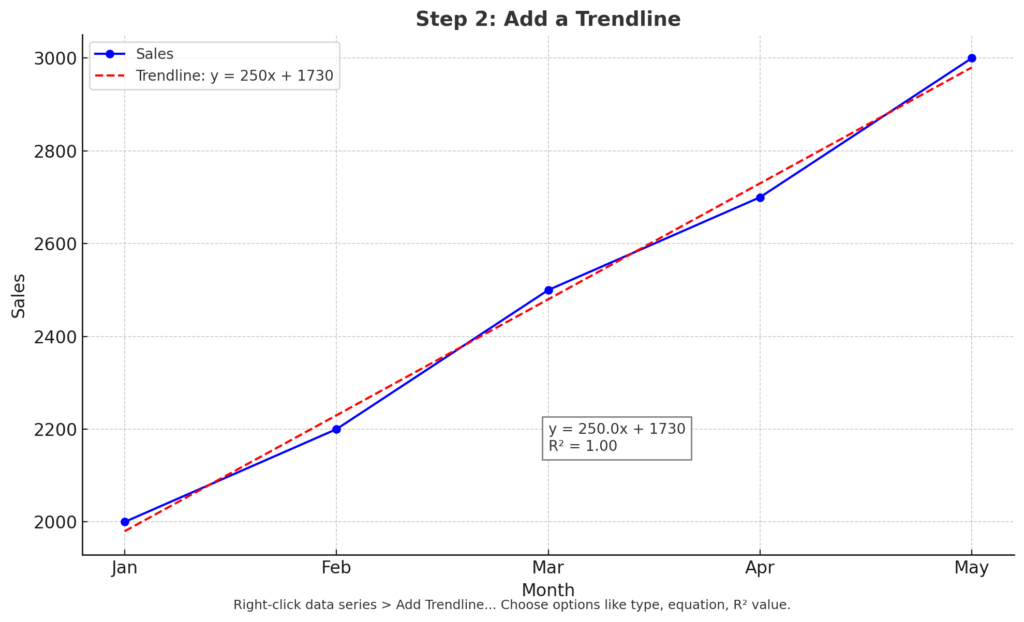
Step 2: Add a Trendline
- Click on the chart to select it.
- Click on the data series (the line or dots).
- Right-click and choose “Add Trendline…” from the context menu.
- A pane will appear on the right with options:
- Select Type: Linear, Exponential, Polynomial, etc.
- Display Equation on Chart
- Display R-squared Value on Chart
- Customize the line’s appearance (color, width, style) as needed.
- Close the pane.
Tip: You can add different trendlines to different series in the same chart.
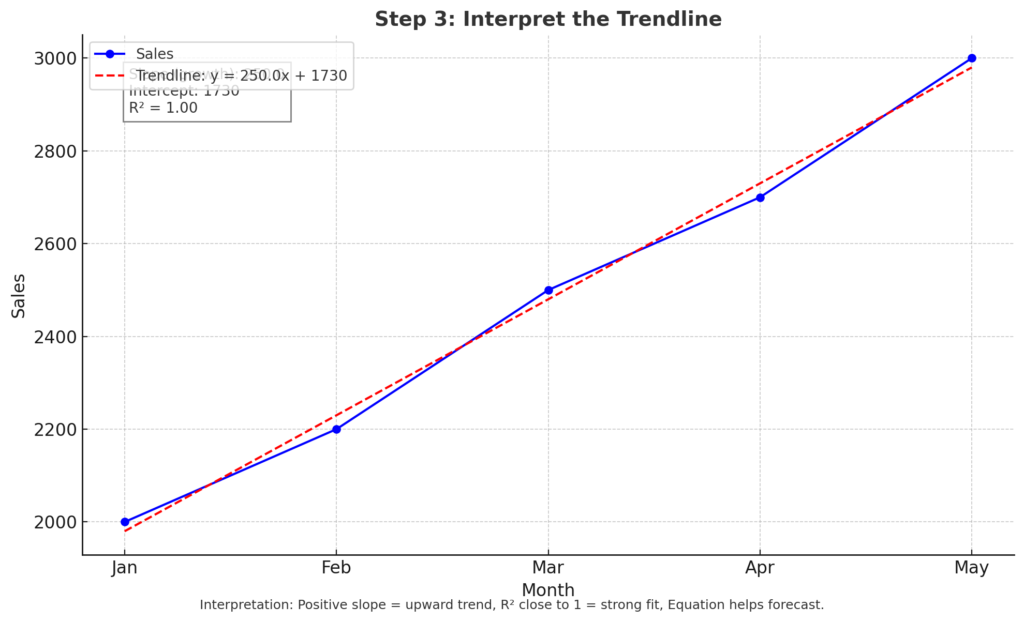
Step 3: Interpret the Trendline
- The slope of the line indicates the direction of the trend (upward or downward).
- The R² value shows how well the trendline fits the data (closer to 1 = better fit).
- The equation can be used for forecasting or modeling.
Real-Life Examples of Using Trendlines in Excel
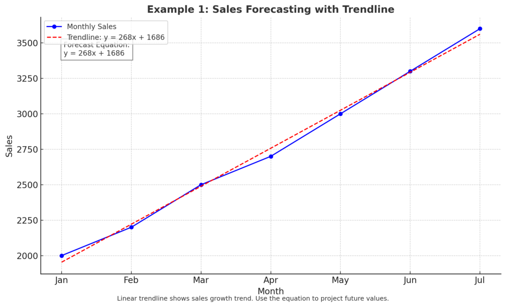
Example 1: Sales Forecasting
You’re analyzing monthly sales and want to see the growth rate over time. Adding a linear trendline shows whether sales are increasing and by how much.
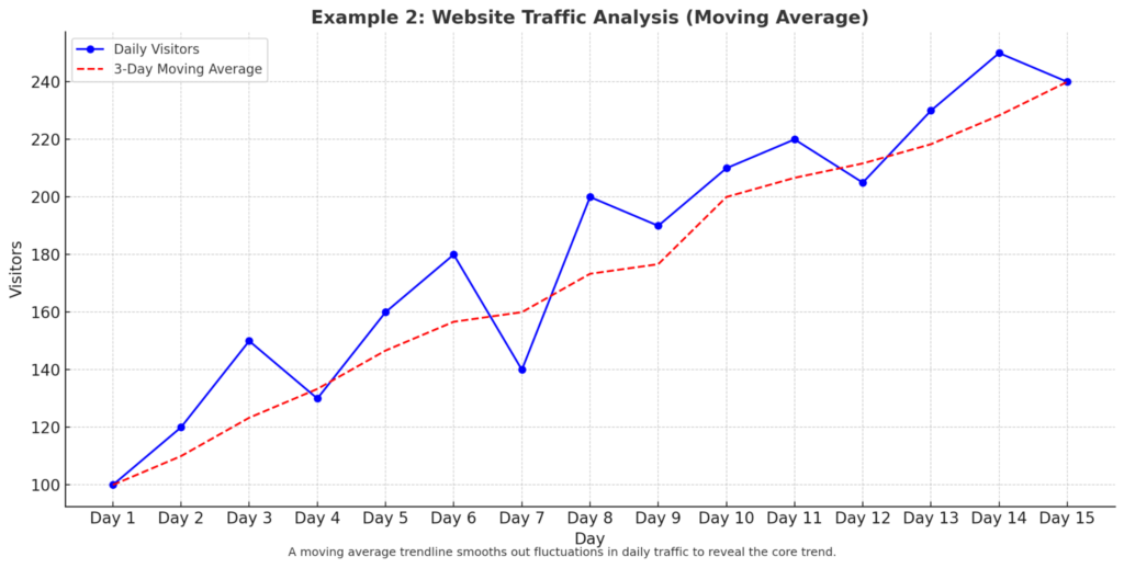
Example 2: Website Traffic Analysis
You have daily visitor numbers to your website. A moving average trendline reduces daily spikes. It also reveals the underlying trend clearly.
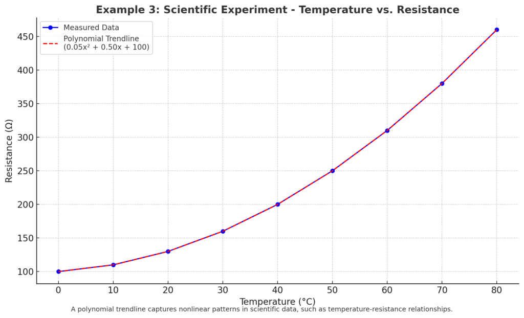
Example 3: Scientific Experiment Data
In a physics experiment, you plot temperature vs. resistance. A polynomial trendline helps you see complex patterns and understand how variables relate.
Benefits of Adding a Trendline in Excel
Reveals Patterns in Data
Trendlines make it easier to see trends that aren’t immediately obvious in raw numbers or charts. A sales chart can seem chaotic, but a trendline shows the overall direction. Is it going up or down?
Improves Forecasting Accuracy
Trendlines offer math equations and visual hints for short- or long-term forecasts. Use the equation from a linear trendline to project next month’s revenue.
Enhances Academic and Scientific Analysis
Students, researchers, and professionals often use trendlines to validate hypotheses or illustrate correlations. Polynomial or exponential trendlines can help model real-world scientific behaviors.
Assists in Strategic Decision-Making
Business leaders can use trendline insights. They help make better data-driven decisions in marketing, HR, or operations. Spotting a consistent drop in performance early through trendlines allows timely intervention.
Professional Presentation and Reports
Trendlines improve dashboards, charts, and presentations. They create a polished and smart look. Adding R² values and equations to reports enhances clarity and trust in the data.
How to add a trendline in Excel | Microsoft
Frequently Asked Questions (FAQ’s)
Can I add a trendline to any chart in Excel?
No. Trendlines work only with charts that show values on both axes. This includes line, scatter, column, and bar charts. They don’t work on pie or area charts.
What is the best trendline type for predictions?
Linear is best for consistent trends. Use exponential or polynomial for nonlinear data. Choose based on the pattern in your dataset.
What does R-squared (R²) mean in a trendline?
R² measures how well the trendline fits your data:
- 1 = perfect fit
- 0 = no relationship
A higher R² indicates a better trendline model.
Can I use a trendline to predict future data?
Yes. You can extend the trendline forward:
- In the trendline settings pane, go to Forecast. Then, enter the number of periods you want to project forward.
- Excel will extend the trendline accordingly.
How do I remove a trendline?
- Click on the trendline in the chart.
- Press the Delete key or right-click and choose Delete.
Conclusion
Adding a trendline in Excel is easy and helps you analyze data. It shows trends clearly, which helps you make confident decisions. Trendlines add context to raw numbers. You can use them for forecasting sales, tracking growth, analyzing scientific data, or building dashboards. Follow this step-by-step guide. Learn about the trendline options. You’ll be ready to make your Excel charts more insightful and professional.