

Error bars are key in data visualization. They show the variability or uncertainty in your data. No matter if you’re a student sharing lab results, a data analyst making reports, or a researcher presenting findings, you can use Excel to add error bars. This helps represent exact deviations for each data point. Excel offers options to customize how you show data. This helps make your data clear and accurate. This guide covers individual error bars. You’ll learn what they are, when to use them, and how to add them in Excel for clear, accurate data.
What is Individual Error Bars?
Individual error bars are tailored for each data point. This means they do not use the same error value for all points in a chart. In standard error bar settings, Excel adds the same error amount to all data points. This means each point has the same positive and negative error. This can be a fixed value or a percentage. In many real-world datasets, like those in science, finance, or experiments, every data point comes with a unique error margin.
How to Add Individual Error Bars in Excel
To add individual error bars in Excel, you need a custom method. This involves using data from another column or range. Here’s a detailed, step-by-step method to do it:
Step 1: Prepare Your Data
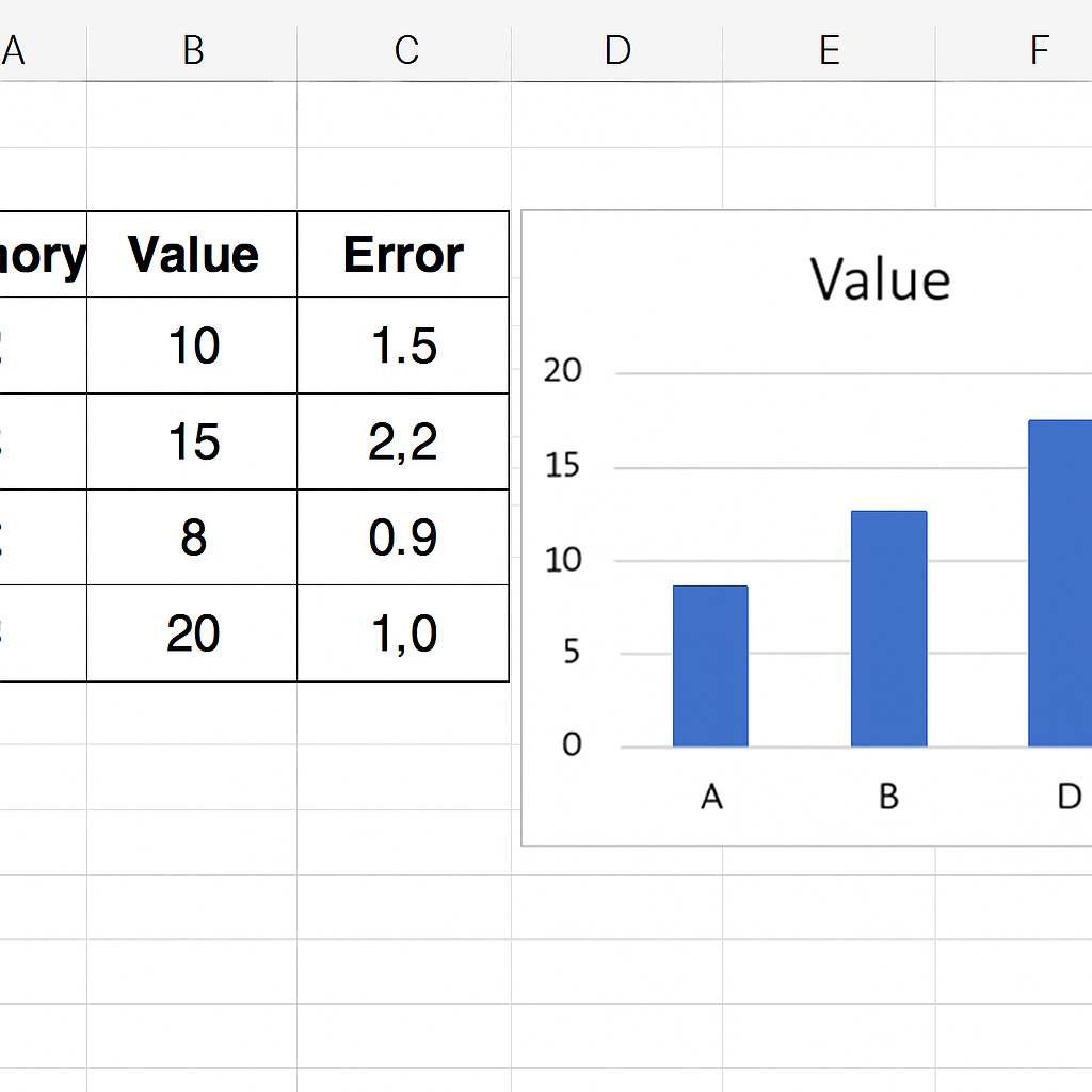
Create a dataset with three columns:
- Column A: Your independent variable (e.g., Categories or X-axis)
- Column B: Your measured values (e.g., Y-axis)
- Column C: The error values for each corresponding data point
Example:
| Category | Value | Error |
| A | 10 | 1.5 |
| B | 15 | 2.2 |
| C | 8 | 0.9 |
| D | 20 | 1.0 |

Step 2: Insert a Chart
- Select the data for the X and Y axes (Columns A and B).
- Go to the Insert tab.
- Choose a chart type, typically Scatter Plot or Column Chart.
- The chart will now display your values visually.
Step 3: Add Error Bars
- Click on any data point in the chart to select the data series.
- Click the Chart Elements button (the plus sign icon on the chart’s top-right).
- Check the Error Bars option.
- Click the small arrow next to Error Bars and choose More Options.
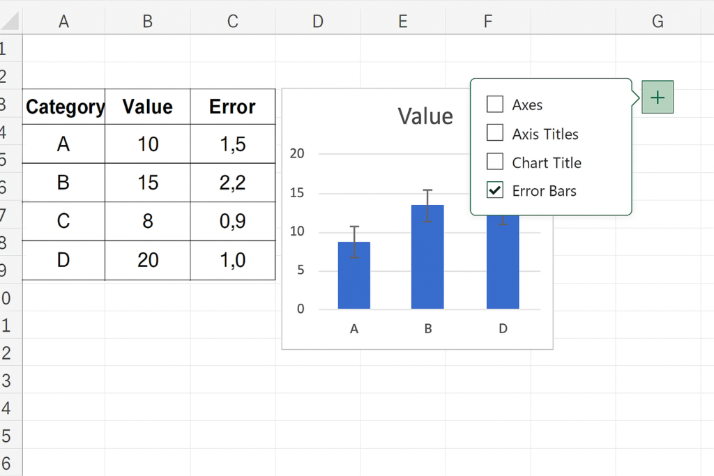
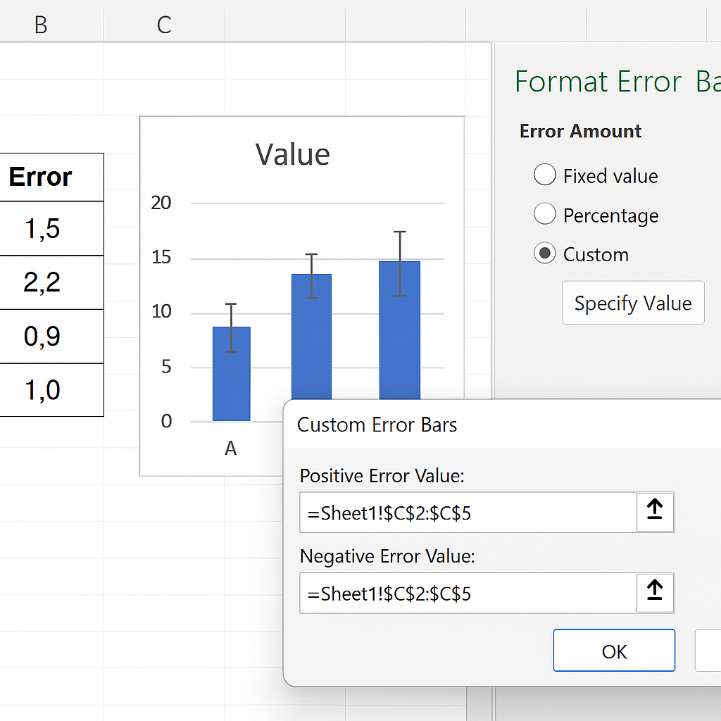
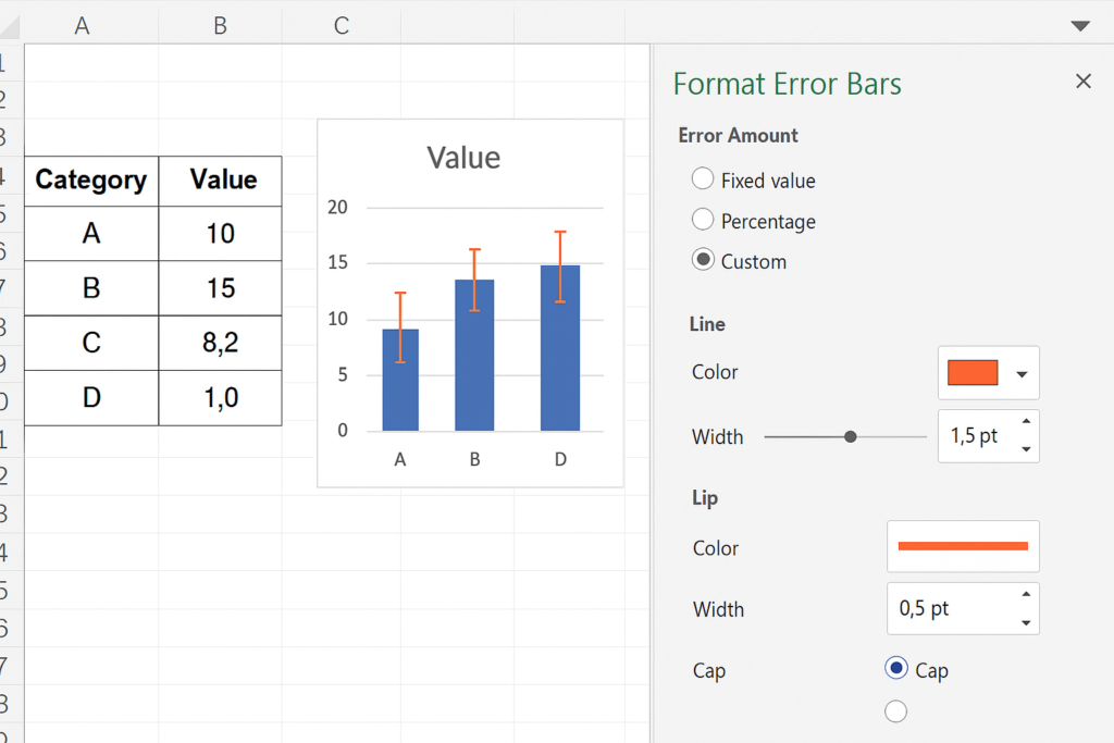
Step 4: Customize Individual Error Bars
- In the Format Error Bars pane on the right, choose Custom and Click Specify Value.
- A new window pops up for Custom Error Amounts.
- Select the range for both Positive Error Value and Negative Error Value. For example, use Column C for your error data.
- Click OK.
Each data point will show its own error bar. This is based on the value in your error column.
Optional: Adjust Error Bar Appearance
- You can change the line style, width, or cap type under Format Error Bars.
- Use different colors for better readability in presentations or publications.
Examples of Adding Individual Error Bars in Excel
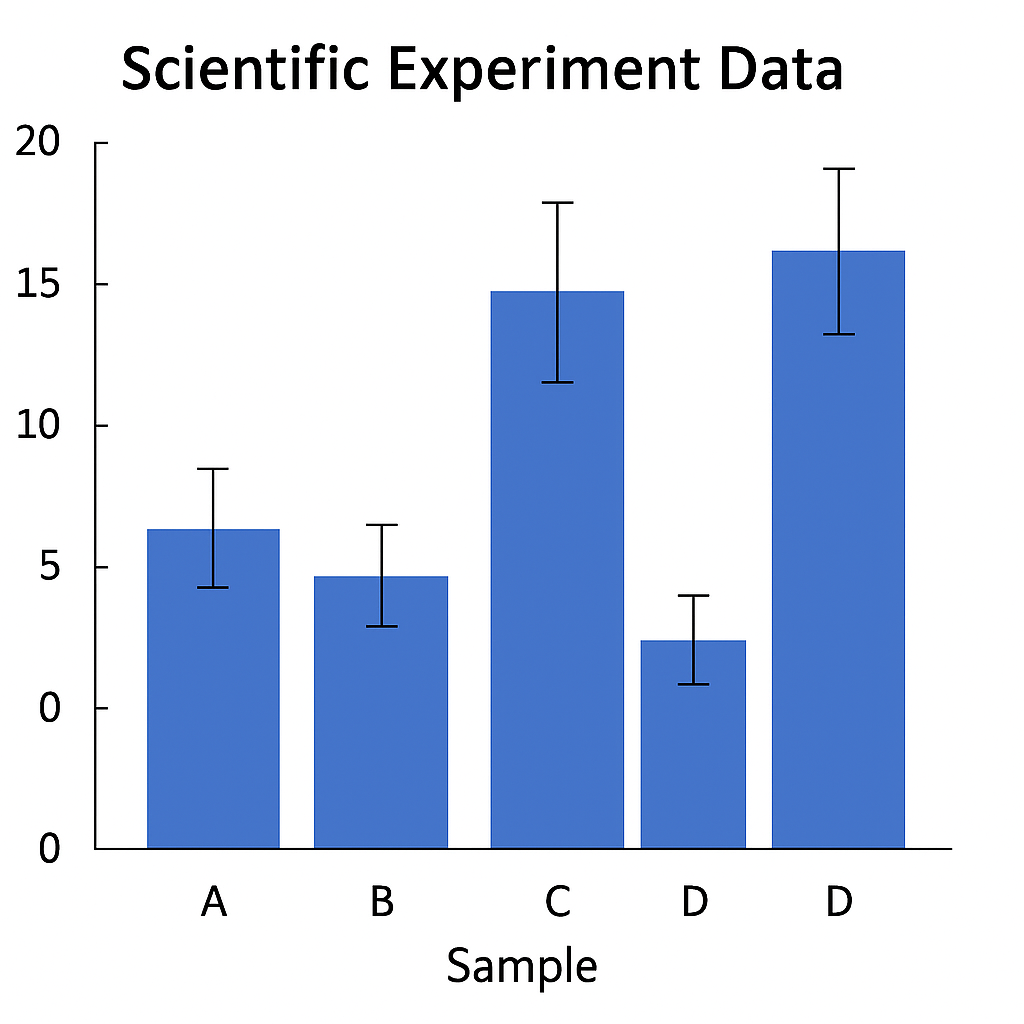
Example 1: Scientific Experiment Data
You’re sharing results from a chemistry experiment. Each sample has a different margin of error. Use actual deviation values for each reading instead of a generic ±2% error. This shows the real variability in measurements. Individual error bars enhance the chart’s accuracy and credibility in science.
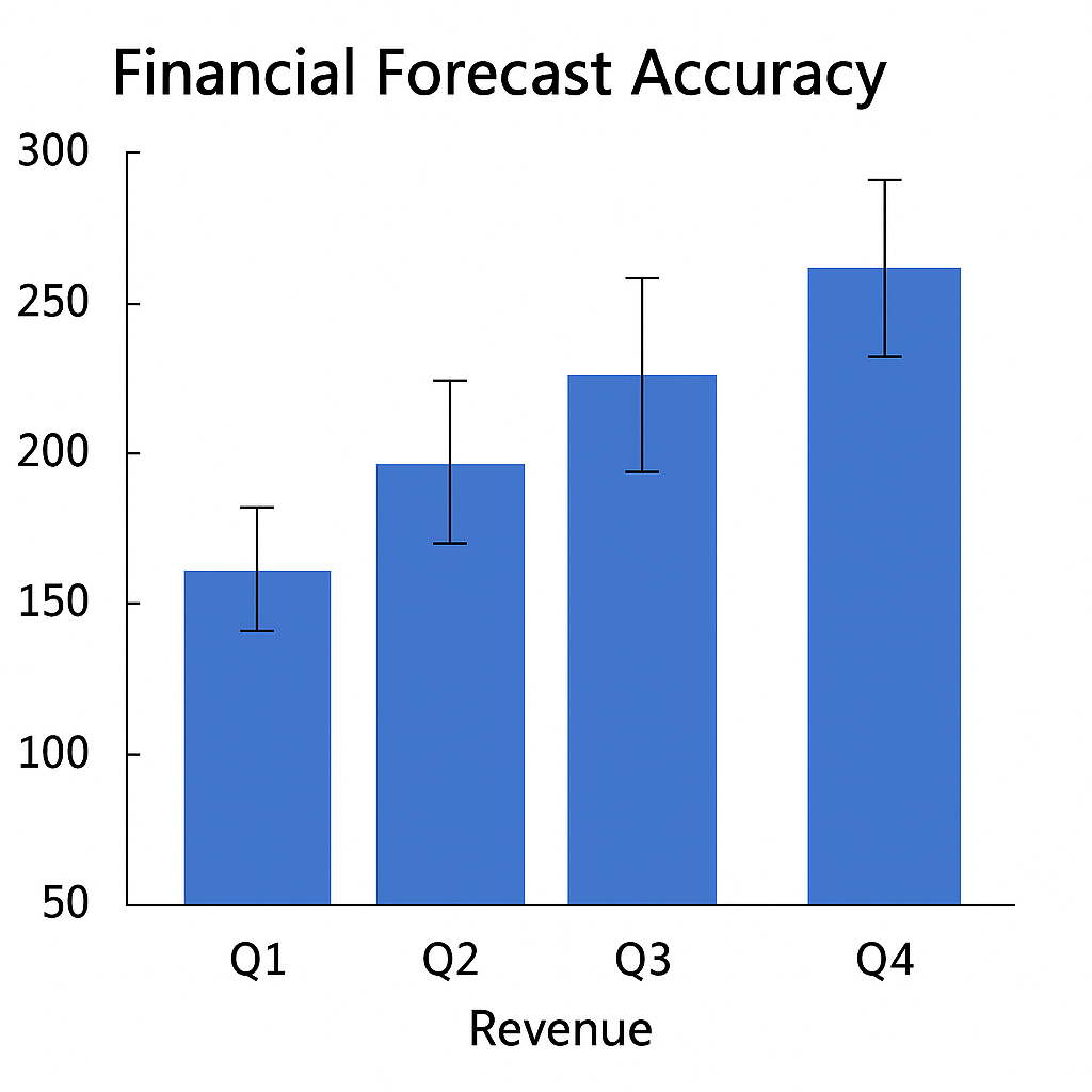
Example 2: Financial Forecast Accuracy
When you look at quarterly revenue forecasts and actual results, include the expected error range. Market volatility changes each quarter, so we use individual error values. This shows which quarter had more uncertainty.
Benefits of Adding Individual Error Bars in Excel
Reflects Real-World Variability
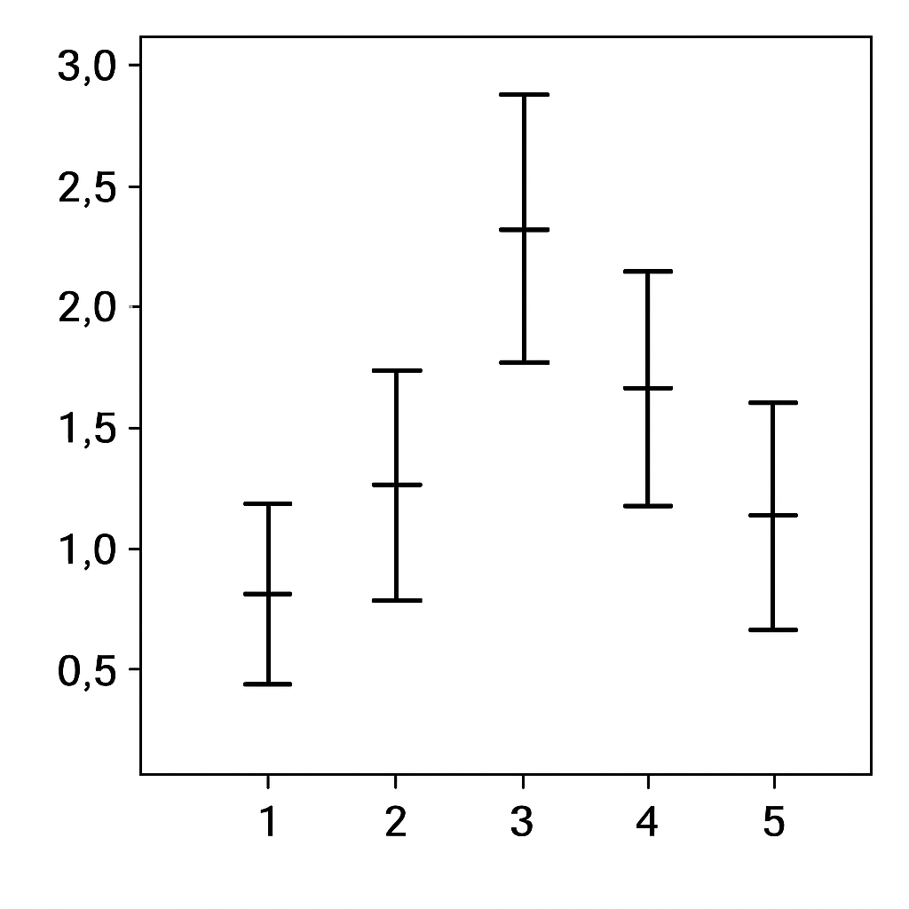
Using a uniform error margin across all data points can mislead viewers. By adding individual error bars, you represent the true variability of each observation. This enhances the accuracy and transparency of your data presentation. This is very important in scientific research. Each measurement can have its own uncertainty. This can happen because of sample size or instrument error.
Improves Data Interpretation
Charts with individual error bars make it easy for viewers to see data strengths and weaknesses. Large error bars indicate less confidence in a value, while smaller ones suggest greater reliability. This visual cue is easier to understand than just using words or tables to explain confidence levels.
Builds Trust and Professionalism
Custom error values show that you’ve carefully considered data uncertainties. In reports for school, business, or the public, this detail shows professionalism. It also shows you pay attention to detail. This makes your analysis more trustworthy. Decision-makers are more likely to trust charts that clearly display potential variation.
Complies with Industry Standards
In academic publishing and medical research, including error bars is often necessary. Excel helps your charts look good and follow best practices. This saves time when preparing data for journals, grant applications, or internal audits.
How to Add Individual Custom Error Bars in Excel | Add Standard Deviation Error Bars in Excel
FAQ’s
How do I add different error bar values to each point in Excel?
To add different error values, click your chart. Then, go to Error Bars and select More Options. Choose Custom and specify a range for both positive and negative error bars. These values must be placed in a separate column next to your dataset.
Can I add error bars to a column chart?
Yes, error bars can be added to column charts, but they work best visually with scatter plots or line graphs. Select the data series, then use the chart element menu to add and customize error bars.
Why are my individual error bars not showing correctly?
Make sure the error range you selected matches the data series in size. If there are mismatched cells, Excel may not apply them properly. Also check that you selected both positive and negative values, even if they’re the same.
Conclusion
Adding individual error bars in Excel boosts the clarity and accuracy of your charts. It also enhances their professionalism. You don’t just use simple guesses. You show the real uncertainty of each data point. This is key in research, business analysis, and academic reporting. Learning to create and customize error bars boosts your Excel skills. It helps you show data that is clear, trustworthy, and insightful. In today’s data-driven world, learning this simple feature can make your charts stand out.