

Data trends over time show key insights. This includes watching a production line, checking customer satisfaction, or assessing health metrics. A Run Chart is one of the simplest yet most powerful tools for visualizing this kind of data. And if you’re using Microsoft Excel, creating a run chart is easier than you think. In this guide, you will learn what a run chart is. You’ll also discover how to create one in Excel. Lastly, you’ll see why it’s a great tool for decision-making and continuous improvement.
What is a Run Chart?
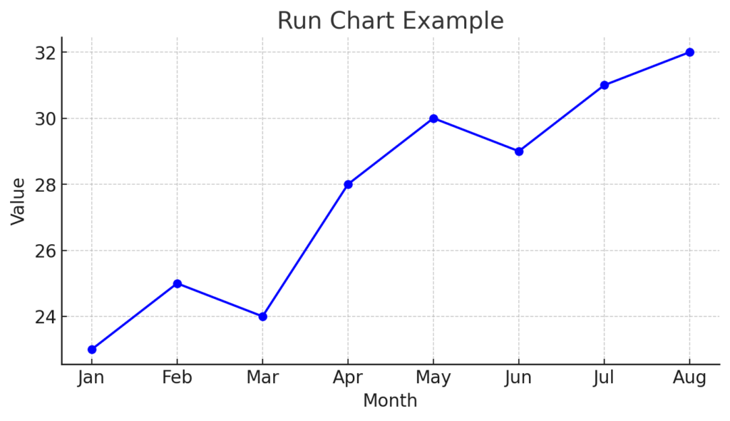
A Run Chart is a line graph. It shows data points in the order they were collected, usually over time. It’s used to identify trends, shifts, or cycles in processes or performance.
Key Features:
- X-axis represents time (e.g., days, weeks, months)
- Y-axis represents the measured value (e.g., defects, sales, satisfaction score)
- Helps detect non-random patterns in data
- Common in quality control, project monitoring, and healthcare analytics
Run charts are common in Six Sigma, Lean, and continuous improvement. They help track process stability and changes.
How to Create a Run Chart in Excel?
Creating a run chart in Excel is straightforward. Here’s a step-by-step guide:
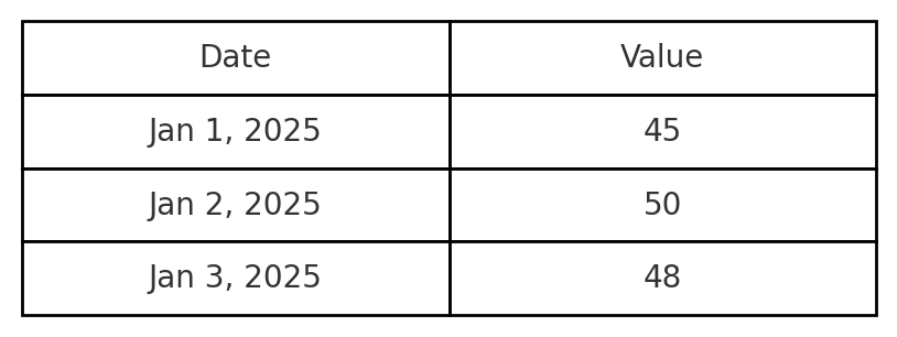
Step 1: Enter Your Data
Structure your data in two columns:
| Date | Value |
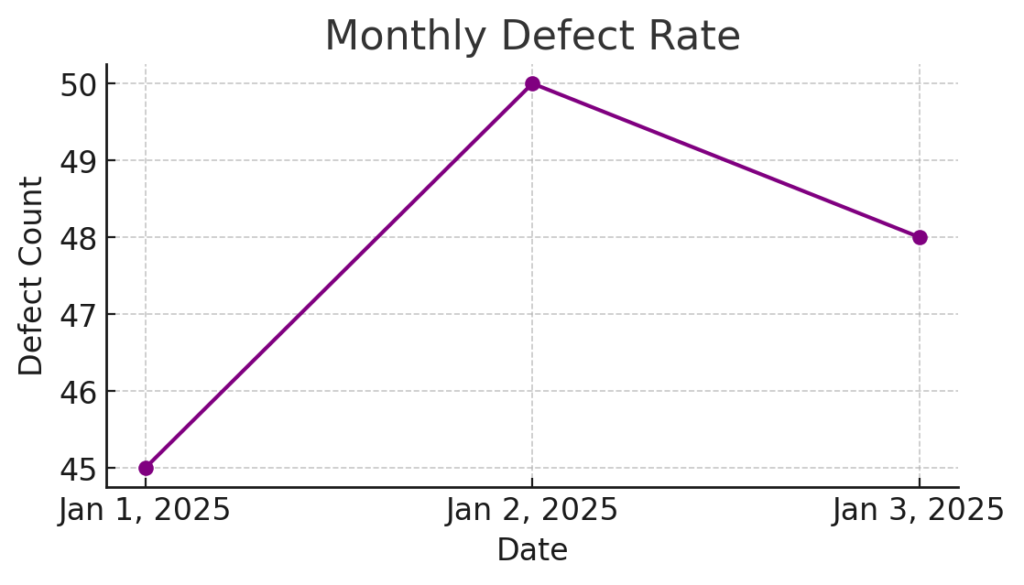
| Jan 1, 2025 | 45 |
| Jan 2, 2025 | 50 |
| Jan 3, 2025 | 48 |
| … | … |
Ensure dates/times are in the first column and the corresponding values in the second.
Step 2: Select the Data
Highlight both columns (Date and Value).
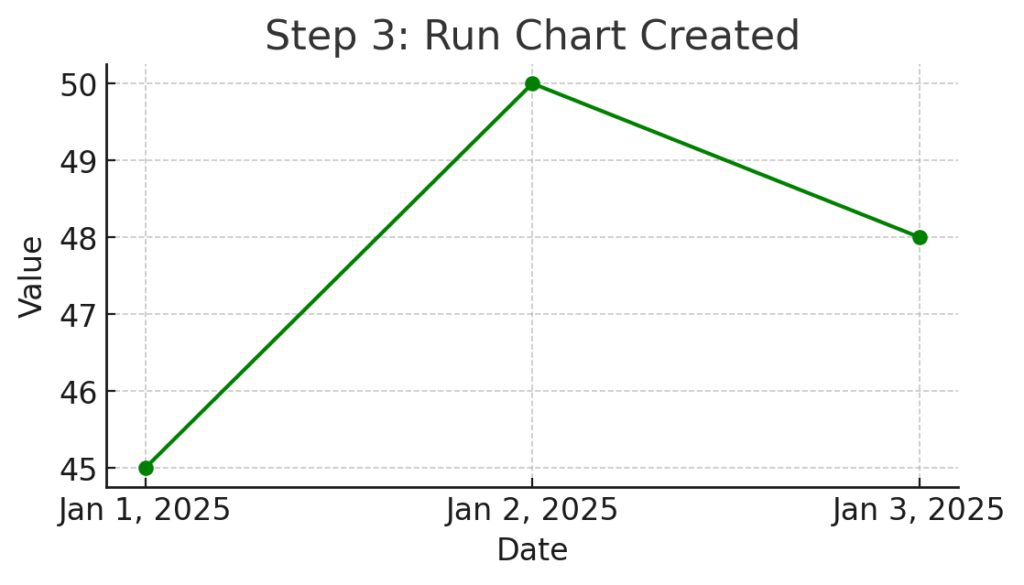
Step 3: Insert the Line Chart
- Go to the Insert tab.
- Click on Line or Area Chart.
- Choose Line with Markers or a basic Line Chart.
Excel will generate a simple line chart with your data plotted over time—this is your run chart.
Step 4: Format the Chart
- Chart Title: Rename to something relevant (e.g., “Monthly Defect Rate”).
- Axis Labels:
- X-axis: “Date”
- Y-axis: “Defect Count” or your measurement unit
- Gridlines & Markers: Enhance visibility by enabling gridlines and using data markers.
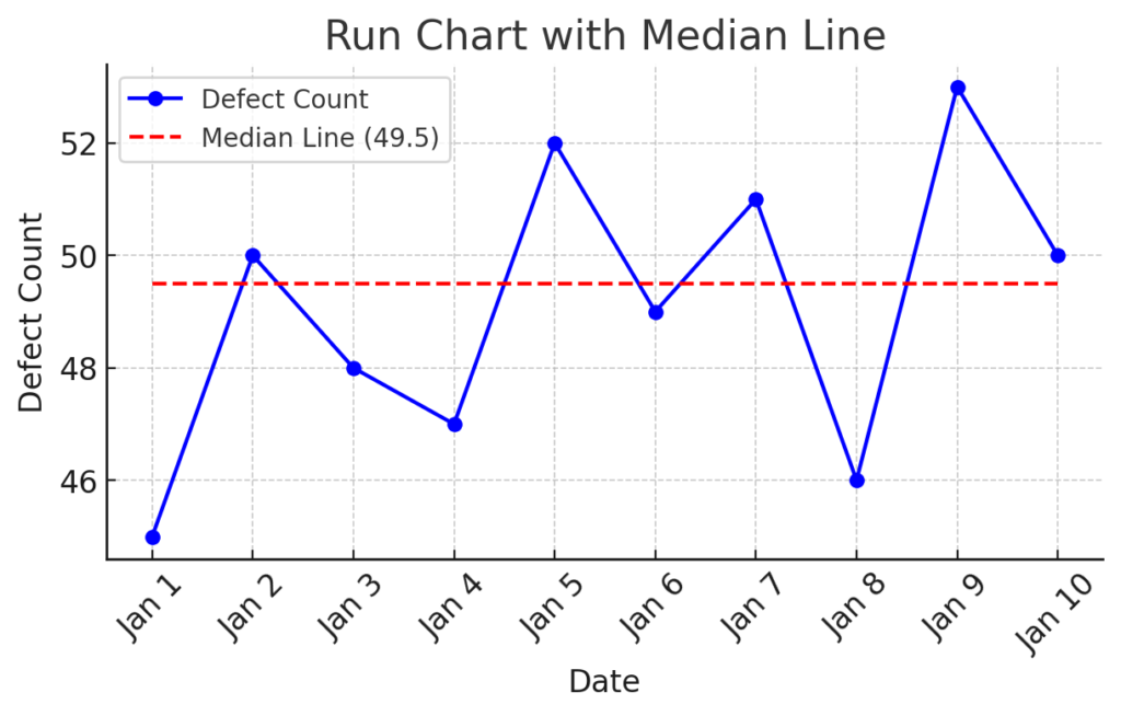
Step 5: (Optional) Add a Median Line
A median line helps spot unusual variations:
- Calculate the median in a new cell: =MEDIAN(B2:B30)
- Add a new column with the same median value for each row.
- Add this column as a new series in the chart.
- Format the new line (dashed or different color) for clarity.
Benefits of Using a Run Chart in Excel
Tracks Performance Over Time
Run charts visually show how a process or metric behaves over a period. This helps organizations monitor progress, spot trends, and detect unexpected shifts.
Example: A call center tracking daily average call duration can identify workload surges or performance dips over weeks.
Identifies Trends, Shifts, and Cycles
Run charts highlight whether variation is random or signals a real change in the process.
Example: In manufacturing, a sudden upward shift in defects may indicate a machine calibration issue—identified early using a run chart.
Simple Yet Powerful for Decision-Making
Run charts are simpler than control charts. They don’t need complex stats, so they work well for non-technical stakeholders.
Example: A school principal can track monthly student attendance rates without needing a background in data analytics.
Enhances Visual Reporting
Excel lets you easily customize your run chart. This helps in stakeholder presentations and team meetings. It adds professional value to your reports.
Example: A project manager can visualize milestone progress and clearly communicate delays or improvements to clients or sponsors.
Encourages Data-Driven Culture
Run charts help teams track important metrics regularly. This encourages accountability and supports ongoing improvement.
Example: A hospital tracking patient wait times can use run charts in daily huddles to engage staff in performance improvement.
How to make Run Chart and Control Chart
FAQ’s About Run Charts in Excel
What’s the difference between a run chart and a control chart?
- Run Chart: Tracks data over time without control limits.
- Control Chart: Includes control limits and is used for statistical process control.
Can I use Excel for control charts too?
Yes, but it requires more advanced functions and formulas. Run charts are much simpler and faster to create.
What’s the ideal data set size for a run chart?
Typically 10–30 data points. The more data, the better you can identify real patterns versus random noise.
Can I use non-date values on the x-axis?
Yes. While dates are common, you can use sequential numbers or event names (e.g., Test 1, Test 2) as long as they reflect order.
Is a run chart the same as a trend chart?
They’re similar. A run chart is a form of trend chart specifically designed to analyze data in time sequence.
Conclusion
Creating a Run Chart in Excel is one of the fastest, most effective ways to visualize data trends over time. In just a few clicks, you can get strong insights, track performance, and make smart decisions. You don’t need special software for this.