
In mechanical and structural engineering, fatigue analysis is key. It helps make designs safe and reliable. A key tool for this is the Modified Goodman Diagram. It shows how alternating and mean stress impact a material’s fatigue life. If you’re an engineer, student, or analyst handling fatigue data, Excel is a great tool. You can use it to graph the Modified Goodman Diagram for your analysis and presentations.
What is a Modified Goodman Diagram?
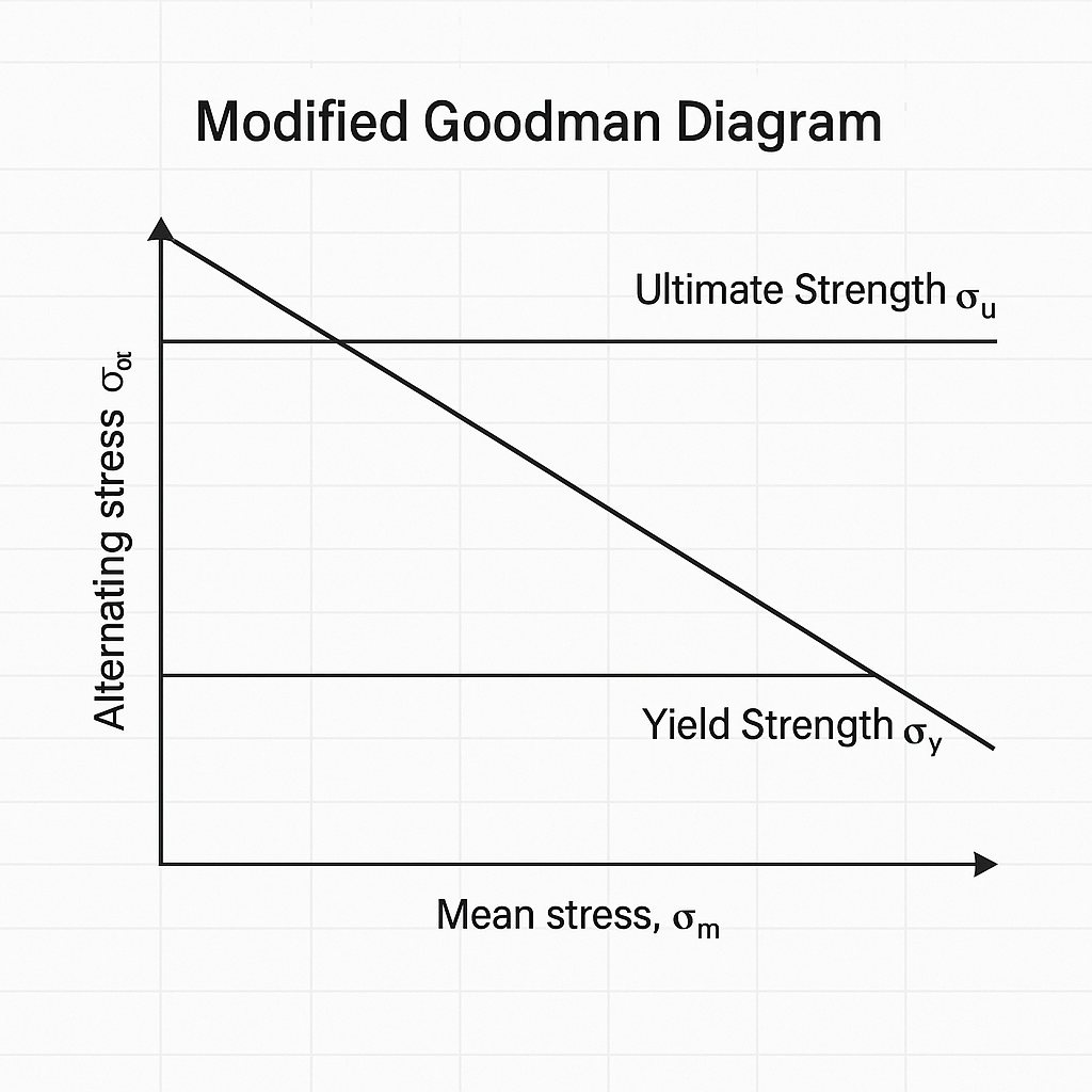
A Modified Goodman Diagram is a graphic tool for fatigue analysis. It helps assess the safety of a component under both alternating (cyclic) and mean (steady) stresses. It is a modified version of the original Goodman diagram. This version considers real material behaviors and factors in safety.
Key Components:
- X-axis: Mean stress (σₘ)
- Y-axis: Alternating stress (σₐ)
- Yield Strength (σ_y)
- Ultimate Strength (σ_u)
- Endurance Limit (σ_e)
The diagram plots the safe operating zone for a material. Any stress combination below the Goodman line is safe for infinite fatigue life, assuming ideal conditions.
How to Graph Modified Goodman Diagram in Excel?
Step 1: Gather Material Properties
You’ll need the following values:
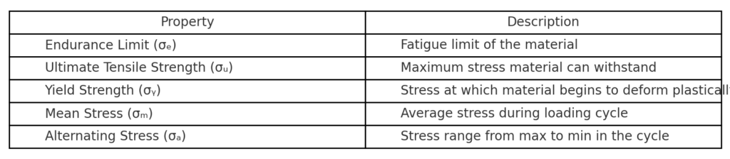
- Endurance Limit (σₑ) — Fatigue limit of the material
- Ultimate Tensile Strength (σᵤ)
- Yield Strength (σᵧ) (optional for additional lines)
- Mean and alternating stress values (for the operating point)
Step 2: Create the Dataset
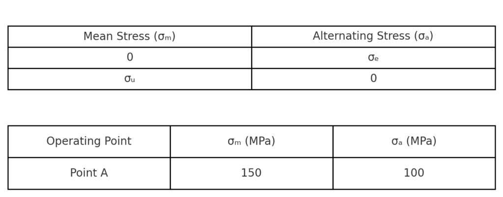
Prepare an Excel sheet like the following:
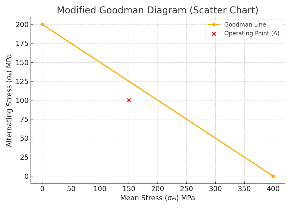
| Mean Stress (σₘ) | Alternating Stress (σₐ) |
| 0 | σₑ |
| σᵤ | 0 |
You can also add operating points for evaluation:
| Operating Point | σₘ (MPa) | σₐ (MPa) |
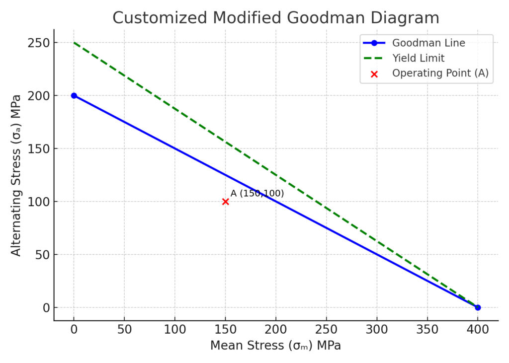
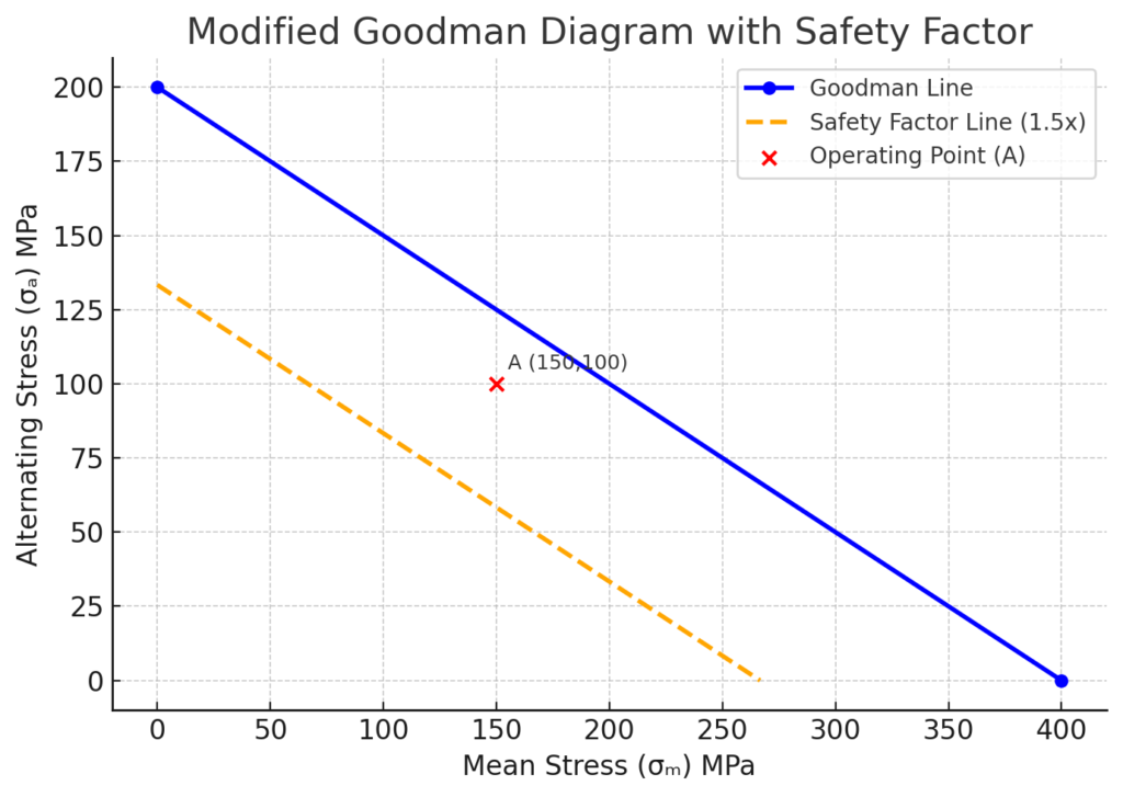
| Point A | 150 | 100 |
Step 3: Insert a Scatter Chart
- Select your data range.
- Go to Insert > Scatter Chart > Scatter with Straight Lines.
- Plot the Goodman line (from 0,σₑ to σᵤ,0).
- Plot operating points using a separate series for better visibility.
Step 4: Customize the Chart
- Add axis titles: Mean Stress (X-axis) and Alternating Stress (Y-axis).
- Add data labels for points.
- Format lines (e.g., solid for Goodman line, dashed for yield limit).
- Add a legend for clarity.
Step 5: Add Safety Factor Line (Optional)
To reflect a factor of safety, reduce the slope of the Goodman line accordingly. For example, with a safety factor of 1.5, recalculate endpoints and replot.
Benefits of Graphing Modified Goodman Diagram in Excel
Accurate Visualization for Design Safety
Using the Goodman diagram lets engineers see if stress levels are safe for fatigue.
Why it matters: It stops overdesign and lowers the chance of fatigue failure. This is crucial for aerospace, automotive, and mechanical systems.
Cost-Free and Accessible Tool
Using Excel avoids the need for expensive engineering software. It provides a cost-effective way to analyze fatigue without sacrificing quality.
Why it matters: Great for students, startups, or field engineers with limited resources.
Flexible Customization
Excel gives you complete control over chart formatting, labeling, and annotation. This makes it great for custom reports, presentations, or academic documents.
Why it matters: Engineers can easily customize visuals for teams, clients, or supervisors.
Supports Sensitivity and Scenario Analysis
Engineers can see how changes in inputs, like the endurance limit or safety factor, affect fatigue life.
Why it matters: Enables proactive design optimization and risk management.
Easy Integration with Other Calculations
Excel can connect Goodman analysis to load cycles, material data, or stress calculations. This creates a live, interactive fatigue analysis dashboard.
Why it matters: Facilitates holistic engineering assessments in one place.
FAQ’s: Graphing Modified Goodman Diagram in Excel
Is the Modified Goodman Diagram different from the original?
Yes. The updated version takes a more cautious approach. It often adds safety factors and adjusts for specific materials.
Can I use Excel for multiple points in a single diagram?
Absolutely. Use separate data series for each point or scenario you want to plot.
Can Excel account for surface finish or temperature effects?
You can manually adjust endurance limit values in Excel before plotting. Excel doesn’t account for these values on its own.
Can I create an interactive Goodman Diagram in Excel?
Yes. Use data validation lists or sliders for dynamic input. Also, use Excel formulas to auto-update plotted points.
Do I need engineering add-ins?
No. You can use Excel’s scatter charts and basic formulas to graph the Modified Goodman Diagram.
Conclusion
The Modified Goodman Diagram is key for fatigue analysis. Excel makes it easy to plot this diagram effectively. With the right setup, you can make top-quality visuals.
These visuals help you:
- Check design safety.
- Compare material performance.
- Make engineering choices.