
In statistical analysis, it’s important to know if your data is normally distributed. This matters a lot for hypothesis testing, quality control, and predictive modeling. A key tool for data scientists, researchers, and analysts is the Normal Probability Plot, also known as a Q-Q Plot. You can’t find a built-in feature for this chart in Excel. But you can still make one using some formulas and a few simple steps. This article shows you how to create a normal probability plot in Excel. You’ll find examples, benefits, and FAQs included.
What is a Normal Probability Plot?
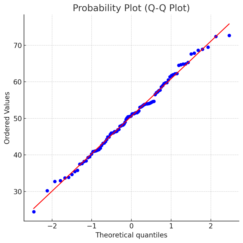
A Normal Probability Plot is a way to check if a dataset is roughly normally distributed.
In simpler terms:
- It shows real data values, arranged from smallest to largest, against theoretical quantiles from a standard normal distribution.
- If the data follows a normal distribution, the points will form a straight diagonal line.
- Deviations from this line indicate non-normality.
This plot is used in quality assurance, ANOVA validation, and regression residual diagnostics.
How to Make a Normal Probability Plot in Excel?
Follow these structured steps to build a normal probability plot in Excel:
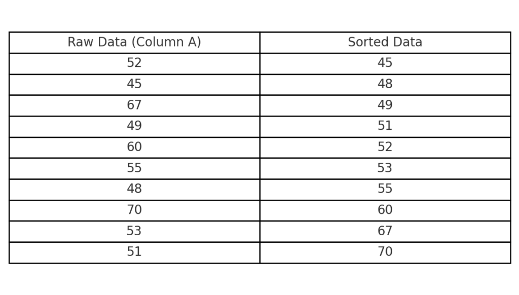
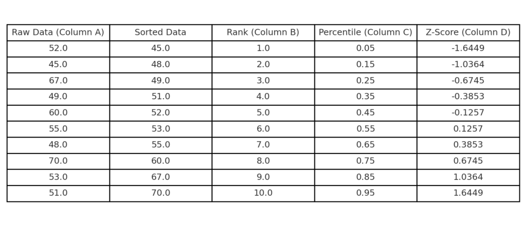
Step 1: Prepare Your Data
- List your raw data values in a single column (e.g., Column A).
- Sort them in ascending order.
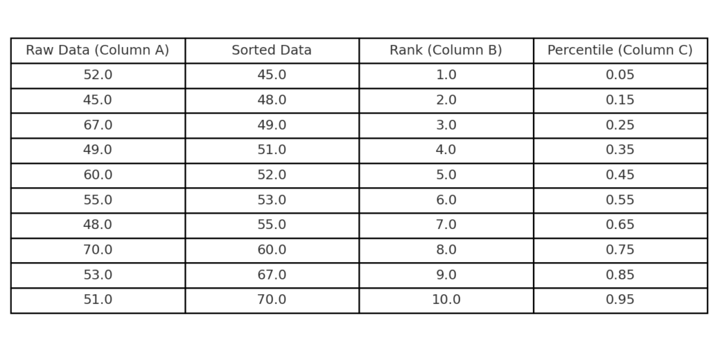
Step 2: Assign Ranks and Percentiles
- In the next column (B), assign ranks starting from 1 to n (where n is the number of observations).
- In column C, calculate the percentile (also called cumulative probability):
=(B2 – 0.5) / COUNT(A:A)
Step 3: Compute Z-Scores for the Percentiles
Use the NORM.S.INV function in column D. This converts percentiles to z-scores, which are standard normal values.
=NORM.S.INV(C2)
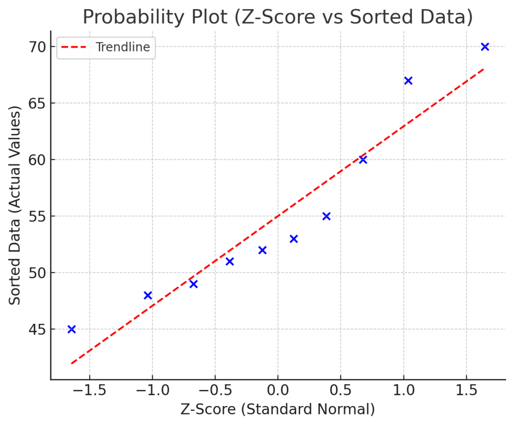
Step 4: Create the Chart
- Select your calculated z-scores (column D) and original sorted data (column A).
- Go to Insert → Scatter Plot → Scatter with Only Markers.
- Format the axes and trendline (optional).
The x-axis will represent z-scores and the y-axis will show your actual data.
Example: Creating a Normal Probability Plot
Sample Dataset:
| Raw Data (A) | Rank (B) | Percentile (C) | Z-Score (D) |
| 23 | 1 | 0.045 | -1.695 |
| 27 | 2 | 0.136 | -1.097 |
| 29 | 3 | 0.227 | -0.749 |
| 34 | 4 | 0.318 | -0.474 |
| 38 | 5 | 0.409 | -0.229 |
| … | … | … | … |
Interpretation:
- If plotted points closely follow a straight line, your data is approximately normally distributed.
- Outliers or curve shapes indicate skewness or non-normality.
Benefits of Creating a Normal Probability Plot in Excel
Visual Check for Normality
Instead of just using tests like Shapiro-Wilk or Kolmogorov-Smirnov, a probability plot shows you visually if your data is normal.
Identifies Outliers Effectively
Outliers stand out as data points far from the line. This makes it easier to detect anomalies or data entry errors that could distort your analysis.
Supports Statistical Assumptions
Many statistical models, such as linear regression, ANOVA, and t-tests, need data to be normally distributed. The probability plot lets you validate assumptions before proceeding.
Quick and Cost-Free Using Excel
You can make a Q-Q plot in Excel. It doesn’t need any add-ons or coding skills. Unlike R or Python, Excel is simpler for this task.
Professional Reporting Tool
Adding a clear probability plot to your report, research paper, or presentation shows strong analysis. This boosts your credibility with clients, stakeholders, and academic reviewers.
FAQ’s on Normal Probability Plot in Excel
Does Excel have a built-in Normal Probability Plot tool?
No, Excel does not offer a built-in Q-Q plot. You can also make one by using the NORM.S.INV function, rank ordering, and scatter plots.
Can I use this plot for large datasets?
Yes. In fact, larger datasets make the plot more reliable. You can create plots for hundreds or thousands of data points using Excel.
What does a curved pattern mean on the plot?
- Concave pattern (S-shape): Indicates left skewness.
- Convex pattern (reverse S-shape): Indicates right skewness.
- Outliers at ends: Suggest data outside the expected normal range.
Should I add a trendline to the plot?
Yes, adding a linear trendline helps highlight deviations from normality. Use the “Add Trendline” option under chart tools for clarity.
Normal probability plots – in excel
Conclusion
Making a Normal Probability Plot in Excel gives you a useful visual tool. This tool checks for normality. Normality is important for assumptions in statistical modeling and quality control. With a few formulas and Excel’s scatter plot feature, you can build a precise and insightful plot in minutes. Using tools like probability plots aligns with both user intent and algorithm expectations. No matter if you’re an analyst, student, or a data-focused leader, mastering this technique boosts your reporting and decision-making skills.