

Understanding population distribution is essential for policymakers, researchers, HR planners, and data analysts. The age pyramid, or population pyramid, shows demographic data effectively. In this guide, we’ll explain what an age pyramid is, how to make one in Excel, and real-world examples. We’ll also highlight key benefits and address common questions.
What is an Age Pyramid?
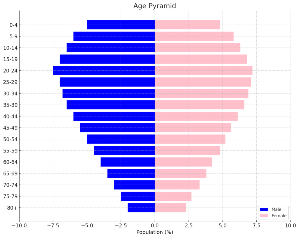
An age pyramid, also called a population pyramid, is a graph. It displays how different age groups are split by gender in a population. Males are usually on the left, and females are on the right. Horizontal bars show the population of each group.
Structure:
- X-axis: Population size (can be in percentages or absolute numbers)
- Y-axis: Age groups (e.g., 0–4, 5–9, 10–14, … 80+)
- Two sides: One side for males, the other for females
This chart is common in demography, workforce planning, healthcare, and marketing.
How to Make Age Pyramid in Excel?
Step 1: Prepare Your Dataset
Start by organizing your data with age groups and population by gender:
| Age Group | Male | Female |
| 0–4 | 1500 | 1400 |
| 5–9 | 1600 | 1550 |
| 10–14 | 1700 | 1650 |
| … | … | … |
| 80+ | 900 | 1100 |
Ensure your age groups are listed vertically, and genders are in separate columns.

Step 2: Convert Male Data to Negative Values
Excel doesn’t support mirrored charts by default, so:
- In a new column, input the male values as negative numbers (e.g., =-B2).
- Keep female values as positive.
| Age Group | Male (−) | Female |
| 0–4 | -1500 | 1400 |
| 5–9 | -1600 | 1550 |
This step creates the visual mirror effect for the pyramid.

Step 3: Insert a Bar Chart
- Select the age group, negative male, and female columns.
- Go to Insert > Bar Chart > Stacked Bar.
- Excel will generate a horizontal bar chart with mirrored male and female bars.
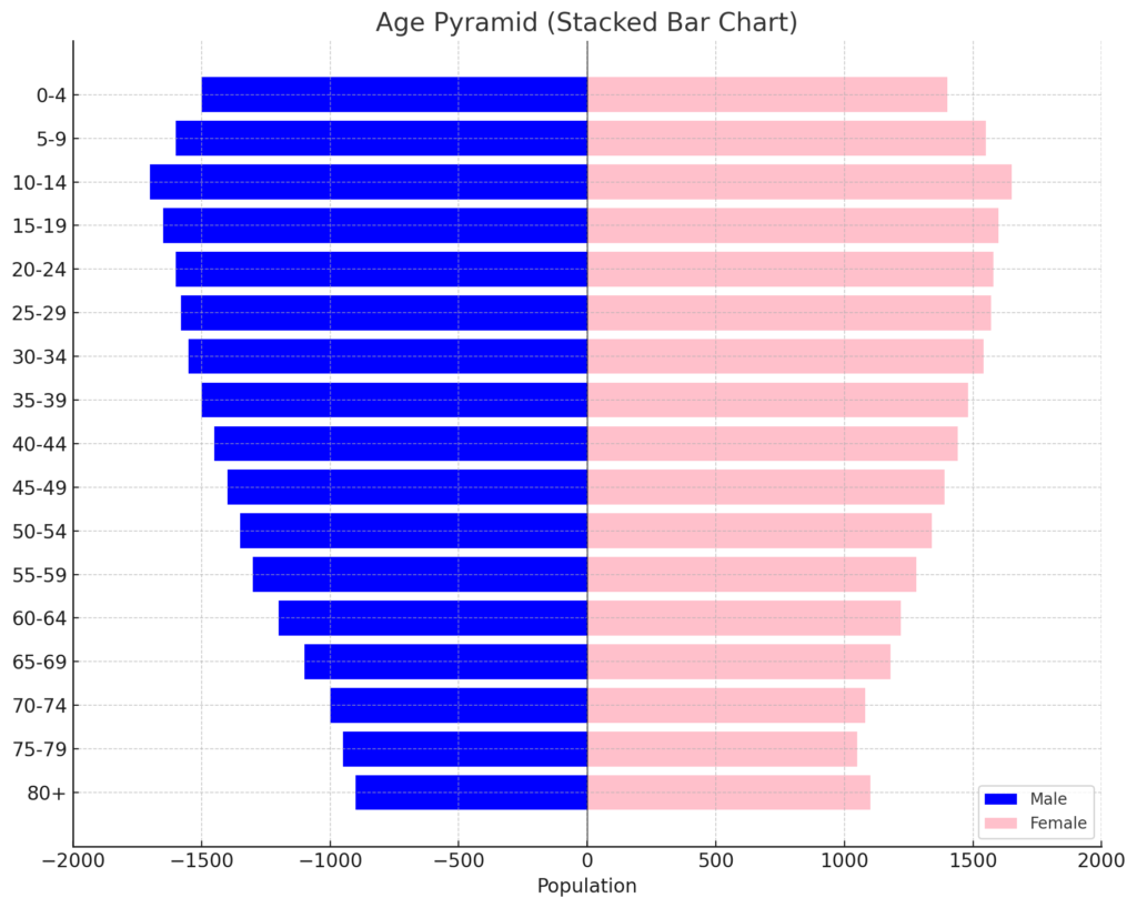
Step 4: Format the Chart to Look Like a Pyramid
- Reverse the Y-axis so age groups start from youngest at the bottom.
- Adjust axis limits to make both sides symmetrical.
- Format male bars with one color (e.g., blue) and female bars with another (e.g., pink or purple).
- Add axis titles: “Population” for X-axis, “Age Groups” for Y-axis.
- Optionally add data labels for better readability.

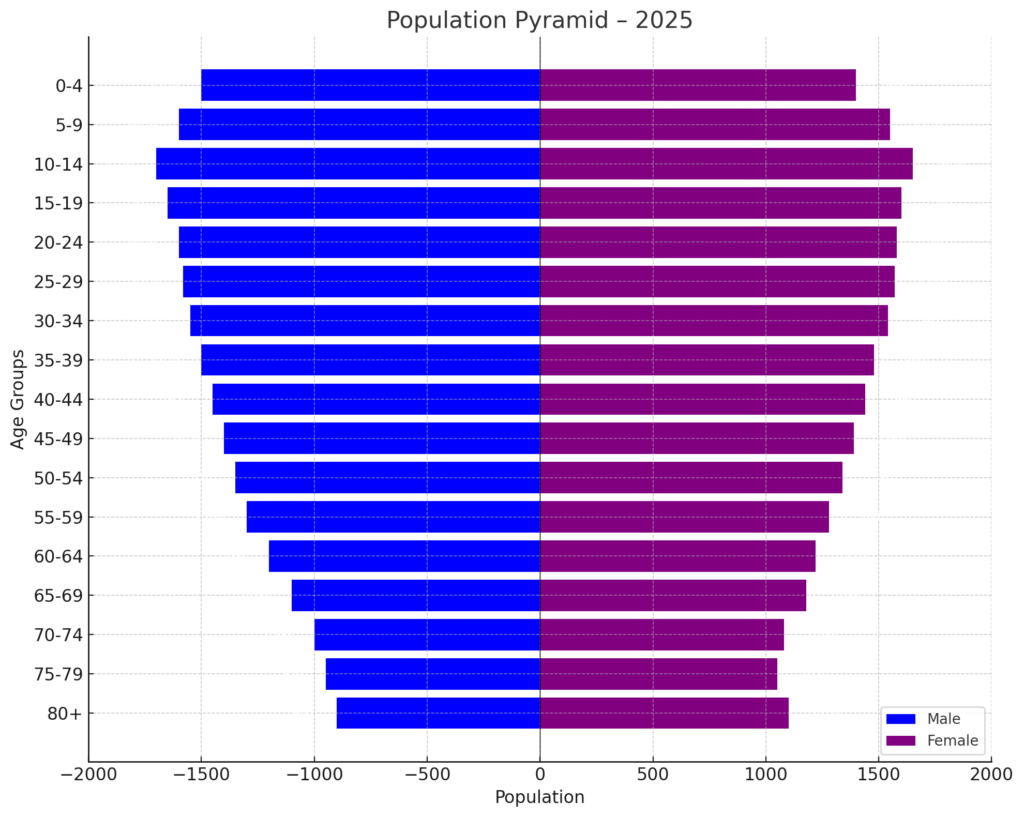
Step 5: Add Labels and Titles
- Add a descriptive chart title like “Population Pyramid – 2025”.
- Use data labels for precise population values.
- Optionally, include a legend showing Male and Female.
You now have a clear, professional age pyramid in Excel.
Example: Population Structure for a City
| Age Group | Male | Female |
| 0–4 | 4000 | 3900 |
| 5–9 | 4100 | 4050 |
| … | … | … |
| 80+ | 1700 | 2100 |
- Convert male values to negative.
- Insert a stacked bar chart.
- Format for readability.
Result: A visually appealing age pyramid showing population trends by age and gender.
Benefits of Making Age Pyramid in Excel
Visualizes Demographic Distribution Clearly
Age pyramids show the population structure at a glance. They reveal imbalances, youth bulges, or aging trends. This clarity is especially valuable for public health planning and urban development.
Highlights Gender Disparities
Side-by-side gender comparison can reveal:
- Gender imbalances in certain age groups
- Higher female longevity in older age brackets
- Policy needs around maternity, elderly care, or education
Enhances HR and Workforce Planning
Businesses can analyze:
- Workforce age trends
- Retirement projections
- Gender balance across age groups
This enables proactive talent management strategies.
Supports Government and NGO Decisions
Governments use age pyramids to:
- Allocate health and education budgets
- Plan pension schemes
- Prepare for population growth or decline
Excel-based pyramids offer a fast, low-cost solution for such analysis.
Customizable for Any Dataset
You can customize:
- Age ranges
- Population units (percentages, raw numbers)
- Colors, layout, and labels
This flexibility makes Excel ideal for presenting age demographics in various sectors.
How to make a Population Pyramid in Excel
Frequently Asked Questions (FAQ’s)
Can I create an age pyramid without converting male values to negative?
No. Excel charts cannot mirror values unless one side (typically male) uses negative values. This is essential for symmetry in the pyramid.
How do I group age ranges in Excel automatically?
Use a helper column or pivot table grouping:
Select age column → Right-click → Group → Set interval (e.g., 5 years)
Can I make an age pyramid in Excel using percentages?
Yes. Convert the population numbers into percentages of the total population. Then, follow the same steps in the chart.
What chart type should I use?
Always choose a stacked bar chart (horizontal) for age pyramids. Avoid column or line charts—they don’t offer the required mirrored layout.
Can this be done in Excel for Mac or Excel Online?
Yes. All key features, like bar charts, formatting, and axis flipping, are in Excel for Mac and Excel Online.
Conclusion
Making an age pyramid in Excel is a great way to show population by age and gender. Whether you’re a demographer, HR analyst, government planner, or student, this tool helps you share data clearly and effectively. Follow this guide to gain technical knowledge and confidence. You’ll make demographic insights easy to access and act on.